Above the Fold: Optimization for Today’s Users
Above the fold is a term used to describe the area at the top of a web page that’s visible without scrolling. What’s above the fold is going to influence UX, web development, analytics and conversions, but its importance has changed over the years.

Does Above the Fold Still Matter?
The above the fold area of a landing page is like the storefront of a brick-and-mortar business or the cover of a book. It’s the first thing a user sees and needs to make a good impression if you want to keep them from bouncing.
That’s why above the fold still matters. However, new research shows people are scrolling more than they used to, which has led some to question whether above the fold design is as important as it used to be.
How we access the Internet and view web pages has changed, but optimizing above the fold is just as important as ever.
Above the Fold Conversion Factor
The above the fold discussion usually focuses on conversions. Since the early days of the Internet, the area above the fold has gotten the most attention. Eyetracking software has provided eye-opening insights. In 2010 a study from the Neilson Norman Group found 80% of viewing time was spent above the fold. In 2018 their newest research discovered that number had dropped to 57%. But people still pay a lot more attention to what they’re viewing above the fold.
For those reasons, above the fold is considered prime real estate for a call to action (CTA). But that’s not where the story ends. Views and conversions are two separate things. There’s strong reason to believe that users who make their way further down the page below the fold are more interested and therefore more likely to convert. And more people are viewing the second screenful. Around 17% of viewing time is spent just below the fold.
The new research suggests above the fold is still a crucial factor for converting users, however, the second screenful has become more important.
Optimizemyairbnb.com is a great example of a website that understands how users view landing pages. This is what is above the fold. The CTAs are right at the bottom edge, which is great placement.
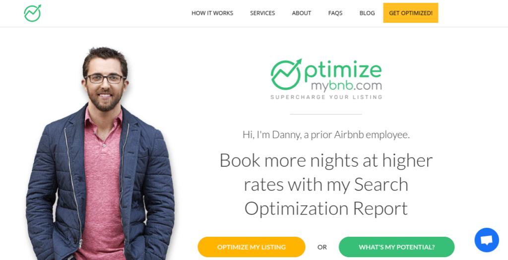
Just below the fold they’ve added their partner logos to and more benefit points to help encourage conversion.

Takeaway: Putting your CTA above the fold is still a good idea, but for conversion rate optimization (CRO) it should definitely be within the first two screenfuls. An alternative solution could be to put another CTA in the second screenful below the fold.
Above the Fold Analytics
If something impacts conversions it’s also going to impact analytics. One of the first things to A/B test is whether the CTA needs to be above the fold or somewhere further down the page. While it’s considered best practice to put your CTA at the top of the page where it can be seen without scrolling that isn’t always the case.
Less than half of users are going to keep reading below the fold, and only 1 in 4 get past the second screenful. This stat is a clear indicator major CTAs need to be high on the page. How high they need to be is a question that can be answered with analytics.
You may find, as the Boston Globe did in the examples below, that putting the call to action below the fold results in the same conversion rate as having it above the fold.
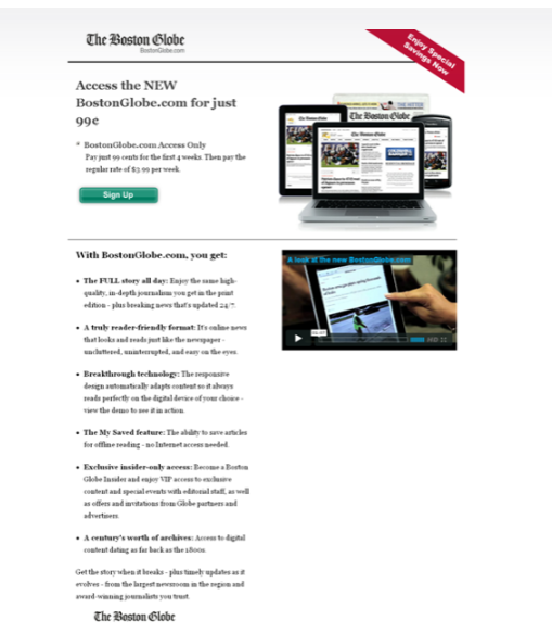
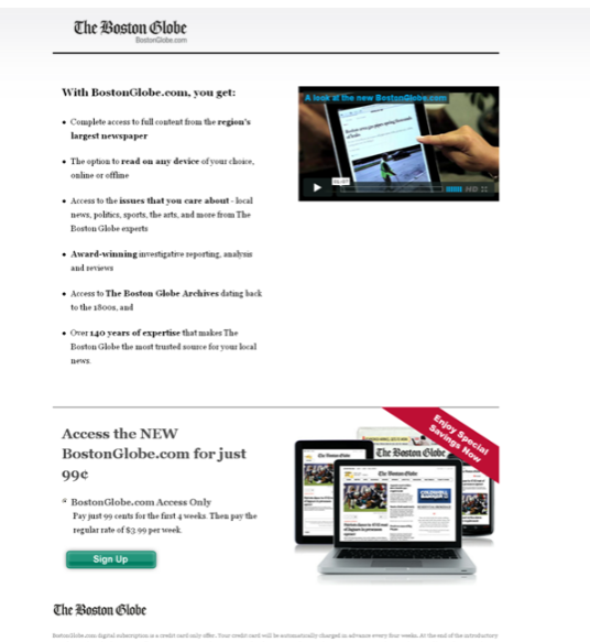
Image source: NeilPatel.com
Both versions of the Boston Globe’s landing page contained the same information, benefit points and offer. The only change was the position of the CTA, which didn’t make a difference.
Ultimately, conversions come down to how well you motivate users to take action within the first two screenfuls. You’ll have more opportunities above the fold because it gets the most attention, but you may need more room to convince the user before they’ll convert.
UX Above the Fold
What’s above the fold is going to have an effect on user experience (UX) the second they land on the page. We read from the top down, and that’s how we view web pages as well. Heat maps show users somewhat ignore the very top of the page, but viewing peaks at around 300 pixels down, solidly above the fold. From there users scan down the page. Another study from Tony Haile, CEO of Chartbeat, found viewing was concentrated just above and below the fold.
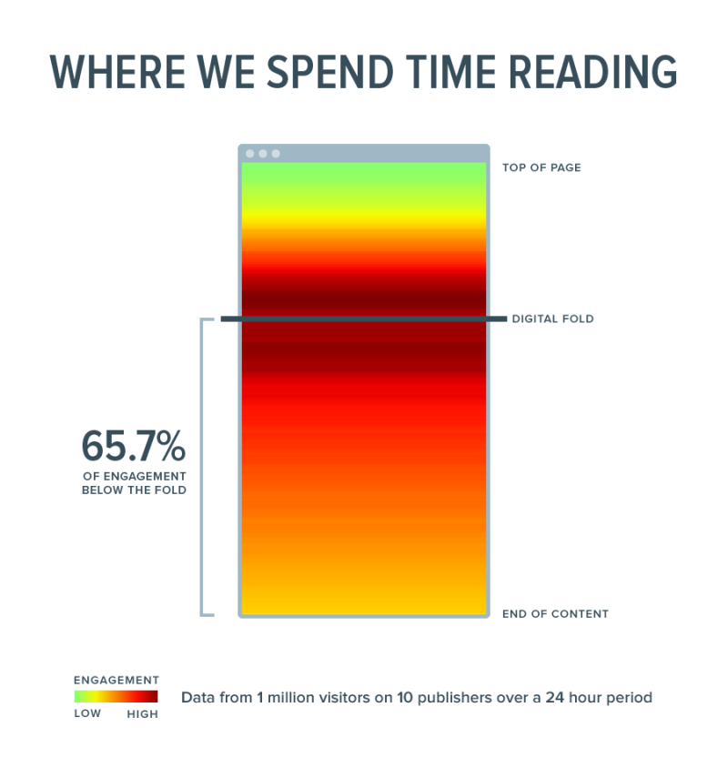
Image source: https://time.com/12933/what-you-think-you-know-about-the-web-is-wrong/
One thing that’s notable from a UX perspective is banner blindness. For so long advertising banners were placed at the top of web pages that users started ignoring the space. Even though banners aren’t typically used at the top of the page anymore, this space is still largely ignored.
Ultimately, good UX is based on a website’s user base. Here again, analytics can give you insight into how your users interact with elements above the fold and how likely they are to scroll down the page. You may find that users click above the fold to find something that was actually further down the page, but they didn’t know to scroll down. Either that wasn’t their natural inclination or there weren’t enough prompters to let them know more was below the fold. In either scenario, UX is lacking.
In terms of UX, the fold is just a conceptual line. Above the fold doesn’t matter if UX is lacking. Whatever is above the fold should draw users in, convey what the landing page is about and give users a great experience.
Web Development Above the Fold
As you can imagine, web developers put a lot of thought into the area that’s above the fold. It helps determine how copy and visuals are organized on the entire page. Today, it’s more of a challenge than a decade ago. There are so many screen sizes the idea of a common fold is long gone.
The increase in mobile use has also influenced the way web designers approach web pages above and below the fold. They are creating longer pages with more negative space because it’s easier to view on a small smartphone screen. Designing this way means more scrolling, but that’s something today’s users are more apt to do.
These days web developers and designers are more likely to treat the area above the fold as a lead-in to the landing page. It’s used to convert but also to keep people scrolling if they aren’t ready to take the next step.
Mobile Devices Have Changed the Fold
Mobile devices have changed the way we approach web page design, including above the fold. The viewport (visible area of a web page) on mobile devices is notably smaller than desktop computers and laptops. Because mobile platforms will continue to be the priority in the coming years as more people use only their smartphones to search the web, emphasis is shifting toward optimizing above the fold on a smaller viewport.
Using a responsive design that automatically adjusts to fit the device helps to ensure the area above the fold is optimized across platforms. However, for many websites, it’s best practice to design for the mobile version first to make sure the area above the fold looks as good as possible.
Conclusion
Above the fold doesn’t carry the same weight as it did a few years ago. It’s still arguably the most important part of a landing page in terms of views and attention, but users are beginning to take in more as they scroll. Analyzing user behavior to understand how your visitors view a page is key for fully optimizing above and below the fold.