![pa-img03[1]](https://mixpanel.com/wp-content/uploads/2020/09/pa-img031-1.png)
In the previous chapters on value and active usage, you learned what to measure, and how to decide whether your users are active or not based on true value moments.
But knowing whether your users are getting value isn’t the end game. The natural next step is to find the dimensions or the texture of the engagement. Why are some users active and others disengaged? Why are some users more active than others? And what can you do about it?
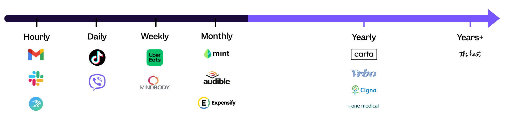
What is my product usage interval?
To group your users based on how engaged they are, we need to know how frequently they typically use your product. Daily? Weekly? Monthly? Every couple of months?
The answer, inevitably, is: “It depends.” Take the now-popular “concierge medicine” category and apps like One Medical, Forward, or Parsley Health. The key value proposition of these apps is the convenience of booking medical appointments, so somebody who books an appointment once every six months on One Medical may well be “very active.” And somebody who books an appointment every year is still “quite active.”
Now let’s flip it and look at the other extreme — a video-hosting social media app like TikTok. The value moment here might be watching a video and “hearting” it. Every night, a typical “active” user can “heart” 10, 20, even 30 videos. That’s a far cry from once a year! In short, there’s no standard “good” product usage interval, and you will need a combination of your product intuition and data to figure out the right one for your product.
Reforge pioneered this way of thinking about product usage intervals with their “habit zone” framework.
Who are my power/core/casual users?
To find your power/core/casual users, start by defining what it means to be “a power/core/casual” user in your product:
- In the Insights report, select an event that you define as your value moment (e.g., “watch video”).
- Highlight “total” to bring up all the different ways you can group your users. Select “total per user.”
- Select your level of aggregation. Median (50th percentile) will be your core users. 90th percentile will be your power users. 25th percentile will be your casual users. By highlighting the line graph, you can view how many videos each group typically watches hourly, daily, weekly, or monthly.
- Customize the date range. Mixpanel will default your line graph over time to a lookback of the last 30 days (from the active day) and a day-by-day count.

Take it one step further. Build and save your new cohorts.
- Click over to “Users” and “Cohorts.”
- Define what it means to be a power/ core/ casual user. For example, “Users that watched videos 2 or more times in the last 7 days.”
- Save the cohort.

Using the median value as a baseline for your analysis, you can create cohorts to track how different groups of users are changing over time.
What is the right definition of power/core/casual users for my product?
The tutorial above suggests that the more videos people watch (daily, weekly, monthly), the more active they are. This is helpful information to figure out which users are the most valuable, and which ones are likely to churn, but there are more dimensions of user behavior you can take into account:
Frequency
How many days (a week, a month, a year) did people use your product?
- For a product where you expect your users to come back weekly, perhaps a power user uses the product 6 out of 7 days, a core user uses the product 3 out of 7 days, and a casual user uses the product 1 out of 7 days.
Breadth
How many different product features or offerings did people use?
- For a ride-sharing company, a power user might have used their economy ride-sharing option, deluxe ride-sharing option, and their vanpool option, whereas a core user might have used only their economy and van pool option, and a casual user may have used just their economy ride-sharing option.
- When a company extends its products beyond the core use case (e.g., a ride-sharing company adds food delivery), you can measure breadth of usage based on the number of unique product offerings users have tried.
Depth
How deeply have users engaged with your product?
- For a video platform company, a depth metric might be the number of videos watched, number of minutes spent watching videos, etc. For a marketplace platform company, it might be the total dollars spent on the platform.
The dimension you end up picking depends on how people get the most value out of your product and what’s correlated with engagement and long-term retention of your users.
How can I tie active usage to my value exchange (monetization) model?
Earlier, we covered various approaches to product monetization. If you’re a PM early in the development process deciding how to monetize, how often (plus, how broadly and deeply) people engage with your product can be a valuable signal. For example, on social media entertainment apps like TikTok, where users engage and get value daily, showing ads might be a natural fit. On the other hand, for a medical service where once a year engagement is expected, an annual subscription is a more reliable way to monetize.
Besides segmenting by level of engagement, how else can you analyze different groups of users with product analytics?
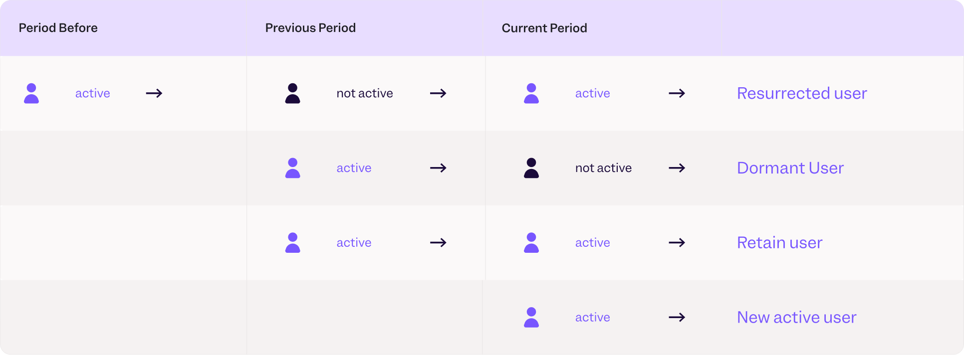
How can I track new users, resurrected users, retained users, and dormant users?
To explore user behavior with lifecycle analysis, create cohorts for each group of users.
In Mixpanel, you can define these groups in two simple steps:
- Select a meaningful event (your value moment, such as “watch video”).
- Check if a user has performed the event within your typical product usage interval (such as 7 days).
For example, to create a cohort for resurrected users, you can select users who:
- Performed “watch video” in the last 7 days
- Did NOT perform “watch video” between 14 and 7 days ago
- Performed “watch video” between 21 to 14 days ago
How to track users throughout their lifecycle
Watch nowCustomer Success Manager, Mixpanel
Now let’s apply similar logic to other cohorts:
- New active users: Performed “sign up” in the last 7 days AND “watch video” at least once within the same time window
- Retained users: Performed “watch video” at least once in two consecutive intervals
- Dormant users: Performed “watch video” in previous usage interval, but did not in the current one
Once you create the cohorts you’d like to track, head over to the Insights report in Mixpanel to visualize their growth over time.