B2B app engagement & marketing psychology

What’s the difference between a B2B app and a consumer app? To end users, there isn’t any.
Behind the keyboard of every business to business (B2B) software instance is a person whose career success rests on their ability to get things done with the application. They aren’t number-crunching automatons and their human (read: emotional) inclinations are a very real driving force behind adoption. When software is good, users talk. When it’s bad, they scream.
Word of mouth from users is behind 20-50 percent of all purchasing decisions and according to Jonah Berger, author of Contagious, it’s 10 times more effective than advertising.
And while the problems B2B apps solve may be complex, their solutions needn’t be. If anything, it’s all the more reason for these applications to feel intuitive.
B2B calls for even better design
There is no denying that designing apps for business is uniquely difficult. Unlike consumer apps, B2B apps must integrate with an existing ecosystem of complex programs such as enterprise resource planning (ERP) and customer relationship management (CRM) software. They must demonstrate redundancy, uptime, and security, but also accommodate a variety of user personas with varying levels of access and interest. And quite often, the product must appeal to a buyer who isn’t even the person who will actually use it.
“B2B systems are often marketed and sold based on their ability to manage data, not to delight anyone using it,” says Duane Gran, a Software Development Manager. It is little wonder that B2B apps are notorious for their confusing interfaces, steep learning curves, and featuritis. B2B product teams are trying to solve a three-dimensional puzzle – upside down, blindfolded, and underwater – of which usability is just one piece.
Yet, at the point of delivery – the user interface – none of that matters. Users will instantly judge the B2B app against the simplicity to which they’re accustomed to at home: Facebook, YouTube, Google, and the like.
The challenge of B2B app design |
||
| Business | Consumer | |
| Ecosystem complexity | Complex; many integrations | Simple; some integrations |
| Persona complexity | Complex; many personas with account hierarchy | Simple; single user |
| Adoption complexity | Complex; many stakeholders, buyer isn’t user | Simple; buyer is user |
| Users’ expectation | Simple; usable by anyone | Simple; usable by anyone |
Users who don’t like what they find are often vocal. They’ll welcome calls from competitors who promise better usability and when they move to different jobs, they’ll ask for the apps they want.
These users don’t care about the challenges product teams face. All they know is whether the app is simple and if it makes their life easier.
For B2B product teams who are ready to accept this, there is a solution: Use the behavioral economics and marketing psychology that’s widely used in consumer app design to streamline their app and boost engagement.
4 ways to streamline B2B apps with marketing psychology
1. Define defaults carefully
In their book Nudge, the Nobel Prize-winning behavioral economists Richard Thaler and co-author Cass Sunstein proposed an idea that now seems obvious: People are irrational. Yet to this day, B2B app designers seem utterly convinced otherwise.
Why else would B2B apps be designed with so many options? There are often too many menus, buttons, widgets, and drop-downs without defaults. B2B app creators expose a cornucopia of complexity to end users and assume they have the tireless mental faculties to figure it all out. But as Thaler and Sunstein note, too much choice can be crippling.
According to Thaler and Sunstein’s research, when presented with too many options, people let the system choose for them. For example, when given thousands of possibilities in which to invest their retirement savings, 92 percent of study participants didn’t investigate beyond the default selection. Rational people would have weighed their options. Real people didn’t even open the booklet.
Defaults are thus incredibly powerful because people are busy and overworked and rely on mental shortcuts. System creators can “nudge” them in whichever direction they want by changing the default option. This is called choice architecture.
B2B designers can become better choice architects by designing their interfaces to mask excessive complexity, reduce user choices, and guide decisions.
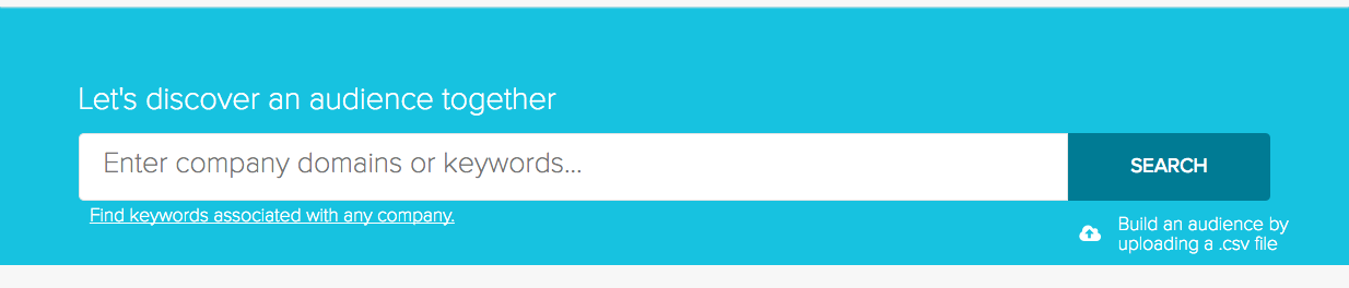
The creators of the B2B data platform EverString mask the complexities of their app by exposing only what users need: a simple search bar.
Where it isn’t possible to reduce options, app creators must at least create a user journey where defaults lead to desirable outcomes. This means simplifying the data imports and integrations necessary to get started, offering tutorials and interactive walkthroughs, and designing apps so that a new user can achieve quick wins without making many decisions. Because likely, many won’t.
2. Use game mechanics
At any given time, it’s estimated that there are 10 trillion unused frequent flyer miles sitting in people’s accounts. Travelers paid for them, but most will go unused. Why? Because airlines know that people love games where achievement is its own reward. And contrary to the myth that this type of gamification doesn’t work for professionals, it does.
“At first we didn’t think adults would go for a points system, but we tried it. Now it’s vital to our advocacy,” says Addy Clark, Director of Customer Marketing at FinancialForce.
Games offer people “tangible evidence of their progress,” writes Jonah Berger, Ph.D. in Behavioral Economics and author of Contagious, which motivates them to work harder, especially when they get close to achieving a goal. This is especially salient in B2B apps where an outcome might not be particularly interesting to the user or where it may be months before users achieve a productivity breakthrough.
Gamification works on a small scale, such as with profile completion bars, and on a large scale, such as hiding easter eggs throughout the application and challenging users to find them. It works in customer portals to get users to help each other and it can encourage users of sites like LinkedIn to post more often. To supercharge its effects, product teams need only make the ‘game’ results public.
People care most about their performance “in relation to others,” writes Berger. “After all, what good is status if no one else knows you have it?” In B2B, this means offering rewards such as certifications and giving recipients notoriety. It means offering awards to power users and inviting them to speak at conferences.
These game-style prizes are a cost-efficient way to boost in-app engagement, mastery, and use, and they also generate what is known as social proof.
3. Guide with social proof
Why is it that nightclubs always seem to have a line? It’s quite intentional: Bouncers keep a line to appear busy. The appearance of business attracts more people. It’s the same reason that McDonald’s advertises “billions of hamburgers served” and why residents of Virginia state saved three billion kilowatt-hours of energy after their bills started showing them how much electricity their neighbors saved. Humans are deeply wired to follow others. B2B product teams can use this tendency to nudge their users.
For example, when notifying users of a new feature, product teams should let them know that others have tried and liked it. Examples of social proof include, and are not limited to:
- Total number or percentage of customers
- Names or logos of recognizable brands
- Testimonials from happy customers or industry experts
- Seals of approval from certifying bodies
- Research or statistics from credible sources
When trying to boost retention-related behaviors, product teams can also rank users on a percentile of basis of achievement and indicate steps they can take toward becoming a ‘power user.’ Like the line at the club, users will wonder what all the commotion is about and feel compelled to follow the herd.
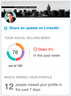
LinkedIn Sales Navigator ranks users on a social selling index.
4. Design your sequence to maximize positive impressions
Vacationers and business travelers may have noticed that in recent years, hotel checkout processes have changed, reports McKinsey. Rather than collect payment at the end, many hotel brands now pre-authorize payments at check-in. Why? Because hotels have learned the recency principle, which warns that that bad tastes linger.
“Days, weeks, and months after using a product or service, customers tend to disproportionately recall the high and low points of their customer journeys and not all the individual aspects of it,” wrote a team from McKinsey who cited work by the Behavioral Psychologist, Daniel Kahneman. If an experience ends on a low point, it will disproportionately affect the overall perception of users.
Hoteliers changed their checkout sequence to swap customers’ final touch point of paying a bill with enjoying a complimentary breakfast. For B2B app designers, the opportunities to change their user journey sequence are endless. And, according to McKinsey B2B customer experience improvements can reduce churn 10 to 15 percent.
With a mixture of product analytics and user interviews, teams can identify low points in the user journey of each customer persona. If designers can’t fix the problem, they should at least make sure that the low points either occur in the middle of the experience or are spread out evenly.
For example, if users are frustrated by slow load times, product teams can add a splash page with daily quotes or helpful tips. This is an excellent opportunity to give the product some personality and cement positive feelings. Apps like Slack, accounting software Quickbooks, and HR software Gusto even offer motivational messages to their users while a page loads.
If users consistently discover bugs within the app, product teams should encourage them to share their experience in the customer help portal and then reward them for their engagement, perhaps with points. This potentially turns a negative experience into a positive one.
And if customers consistently get lost in, say, an advanced reporting suite, B2B designers can offer them better templates or insert customer support chat features to get customers unstuck.
Whenever possible, app designers should try to end each interaction on a high note. Not all brands can afford to be as irreverent as MailChimp, whose mascot offers business users a high-five after sending an email, but every B2B app designer should try to instill the same sense of accomplishment.
Want to learn more about marketing psychology? Here are a few good books:
Thinking Fast and Thinking Slow, Nudge: Improving Decisions About Health, Wellness, and Happiness, Influence: The Psychology of Persuasion, and Contagious: Why Things Catch On
Want to learn more about your users? Check out Mixpanel.