
Product analytics examples: 10 use cases for 2026 (including AI)

Product analytics is moving fast right now. AI-powered features, expanding data infrastructure, and increasingly sophisticated instrumentation are all opening up new ways for product teams to understand and act on user behavior (alongside new questions about what to measure and how).
At Mixpanel, we work with data across thousands of products, and we want to share what we're seeing as the discipline evolves. We pulled a lot of that together into our 2026 State of Digital Analytics, but benchmarks and trends only go so far. So we also wanted to make things tangible with real examples of product analytics in action right now.
This article pulls together 11 examples across five use-case categories:
- AI analytics
- Product launch analytics
- Product growth analytics
- Product-market fit analytics
- Retention analytics
Each example shows a real decision that followed real data; not just a metric on a dashboard, but an action a team took because the numbers told them something specific.
Whether you’re a product manager diagnosing why users aren’t returning after day one, or a growth lead trying to figure out which feature is driving paid conversions, these examples give you a concrete frame for what product analytics looks like in practice.
What is product analytics?
Product analytics tracks how users interact with your product—every click, session, feature use, and drop-off—and makes that behavioral data analyzable. Unlike web analytics, which primarily measures traffic, product analytics captures the quality of engagement: who activated a feature, how often they returned, where they got stuck, and what sequence of events predicts long-term retention.
The core inputs are events, discrete user actions that your team implements and tracks. From there, you can build funnels, retention curves, cohort comparisons, and behavioral flows that turn raw user data into decisions. The goal is to drive real insight that’s accessible across your company.
AI product analytics examples
AI is the fastest-growing product vertical in Mixpanel’s 2026 State of Digital Analytics data, and it’s generating a distinct measurement challenge. Tracking AI feature performance isn’t just about counting impressions or clicks. It requires understanding whether users are actually integrating AI into their workflows, or just trying it once and moving on.
That said, AI measurement is still early-stage across the industry. Here at Mixpanel, we’re capturing what we're seeing in the data and what the teams are doing right now. We’ll update this section with even more examples as AI feature analytics matures over the next few years
Tracking copilot usage
Consider a B2B SaaS product that ships an “ask your data” AI copilot, a natural language interface where users can query product data without writing a single line of code. The feature launches, early adoption looks encouraging, and then the team realizes they can’t actually tell whether users are getting value from it. Click data says “people opened the copilot”, but nothing about what happened next.
Tracking copilot usage well means going beyond “feature was clicked.” Some of the events that actually matter are:
- Prompts per session and per user. Not just whether users opened the feature, but how much they interacted with it. A user submitting five prompts in a session is quantitatively different from one who submits once and stops.
- Power user rate. The segment of users submitting N or more prompts over a defined period. This cohort is your early signal: if the feature has real value, this group finds it first.
- Time to first prompt. The activation metric for AI features. A long time-to-first-prompt might point to a discovery or onboarding problem, not a quality problem with the feature.
- User retention after AI feature usage. Does engaging with the AI feature correlate with higher downstream retention? This metric connects AI feature quality to business outcomes. This is one of the harder ones to measure cleanly, because it requires correlating feature-level behavior to cohort-level retention curves.
- Goal achievement rate. Measured via user-confirmed feedback: did the user get what they came for? Yes, this is inherently self-reported, but it’s also a direct signal that most other metrics only approximate.
Mixpanel Flows lets teams visualize the most common paths users take within and around a feature, including where they abandon it. For copilot features, that’s often where the most valuable product improvements are hiding: a prompt type that never leads to action, a response format users consistently ignore, or an input field where the AI experience simply breaks down.
Measuring AI feature adoption
A user who clicked an AI summarize button once and never touched it again isn’t an AI adopter. They’re a churned AI user.
Real adoption means the feature becomes part of a user’s workflow. A practical AI adoption funnel has five rough stages:
- Feature discovery
- First use
- Second use (typically within seven to 14 days)
- AI-assisted task completion
- Weekly habit established
To get a realistic read on adoption, define your adoption milestones as funnel steps in Mixpanel, then measure conversion at each stage. If you see a sharp drop between “first use” and “second use within seven days,” that’s probably an onboarding problem. When the drop is between “second use” and “AI-assisted task completion,” that might be more of a feature value problem. The funnel tells you which problem to solve first.
Moving from traditional metrics (impressions, clicks) to adoption signals (AI-assisted task completion, re-engagement within session) is one of the most important shifts a product team can make when measuring an AI feature.
Product launch analytics example
Before Golfshot released Auto Shot, the team used Mixpanel to instrument Apple Watch and iPhone events during beta testing, tracking different types of golf swings and movements to validate their machine learning model. The analytics data told them when the model was performing well enough to go to market, and adoption and utilization tracking after launch kept the iteration loop tight.
We released Auto Shot tracking a year and a half ago and continue to see adoption and utilization rate grow in Mixpanel... Mixpanel records the events [swings, hitting a ball, not hitting a ball, jogging to get the ball, etc] from the Apple Watch and iPhone and knows what to count as a successful swing. When we felt confident with the data and [our] ML model, we knew we could take it to market and begin promotion.”
It’s a clean example of using product analytics not just to understand users after a launch, but to validate a product decision before it. The timing was based on behavioral data confirming the product was ready for real users.
Product growth analytics examples
When AB Tasty shifted to a product-led growth (PLG) strategy, they needed to see friction in the product in near real-time. Waiting for weekly data pulls wasn’t compatible with the iteration speed PLG demands.
Using Mixpanel Funnels, they identified friction points in their product tour and acted on the data. The percentage of users skipping the product tour dropped by 40%. AB Tasty learned that when users skip your product tour, it’s rarely because they don’t want to learn the product: it’s because the tour itself is the friction.
AB Tasty’s PLG strategy succeeded because they could measure it continuously. The shift from “marketing drives growth” to “product drives growth” only works if you can see, in real time, whether the product is delivering enough value to do that job.
Using product analytics to power growth
Lemonade entered insurance, an industry that had gone largely unchanged for over 150 years, and built its entire growth strategy around product data from the start. The team used Mixpanel to track events and gather behavioral insights from inception, not as a bolt-on after product-market fit.
The results reflected the strategy: in one year, Lemonade secured over 70,000 insurance policies for more than 100,000 policyholders. More importantly, that growth was driven by a continuous feedback loop between user behavior and product decisions.
Moving from “hunches” to data (a historical example)
In the years before Primephonic was acquired by Apple Music in 2021, the classical music streaming platform used Mixpanel to diagnose a counterintuitive problem: subscriber numbers were growing, but app downloads were declining.
The cause turned out to be friction in the signup flow. Their web-based registration process was failing for a significant portion of users. By analyzing the funnel in detail, identifying the exact step causing drop-off, and fixing it, they reached an 80% signup completion rate.
The lesson holds: growing headline metrics can hide serious product problems. Funnel analysis surfaces the gap between apparent growth and the actual user experience. The overall number looked fine, but the funnel showed where users were leaving money on the table.
Product-market fit analytics examples
Talent platform CakeResume uses Mixpanel to track conversion events across markets, which surfaced an unexpected finding: Indonesian users were converting at significantly higher rates than users in other geographies. That data gave the team the confidence to reallocate resources toward Indonesia and grow market share there.
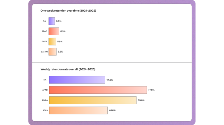
We saw correlating metrics in the wider data from the 2026 State of Digital Analytics: B2B SaaS weekly retention in APAC is 77.9%, compared to 44.6% in North America. Even small differences in regional retention can point to large differences in growth potential, providing teams with new avenues for revenue generation.
Determining fit in a highly competitive market
When Passion Factory launched their chatbot-powered fitness app in Korea’s saturated health and fitness market, product-market fit had to be proven. They used Mixpanel Funnel reports to track drop-off points in the user journey and built more personalized dialogue options where users were leaving. Retention analysis helped them track consistent growth in user retention over time, giving them the data to validate fit before committing to scale.
Track how your retention curves change over time by user cohort; a flattening retention curve is the clearest signal you’ve found product-market fit.
Doubling marketing ROI with better product-market fit data
Evulpo, a learning platform operating across seven European countries, used Mixpanel to compare retention and engagement by geography. The data showed a clear pattern: their product had a significantly stronger fit in German-speaking Switzerland than in the French-speaking region.
That insight reshaped Evulpo’s marketing spend. By redirecting digital campaigns toward their stronger market, they doubled their marketing ROI.
Mixpanel gives us an overview of our performance in different countries. It allows us to understand where we have product-market fit and has optimized our marketing investments, helping to achieve a fairly better ROI.”
The Evulpo story is a strong example of what the Mixpanel team calls “Measure What Matters.” The company avoided chasing vanity metrics and instead tracked the behavioral signal that connected product engagement to marketing efficiency.
Retention analytics examples
One of the valuable uses of product analytics is identifying the ”aha” moment, the specific in-product behavior that predicts whether a new user will become a long-term user. The pattern works like this: you take two cohorts of users who signed up in the same week. One cohort completed a key action in their first session; the other didn’t. You compare their 30-day and 90-day retention curves. When the curves diverge significantly, that action is a leading indicator of retention.
A developer productivity platform might discover that users who run their first automated workflow within 24 hours of signup retain at three times the rate of users who don’t. That single finding changes the entire onboarding strategy: the goal is now to get every new user to that workflow trigger as fast as possible.
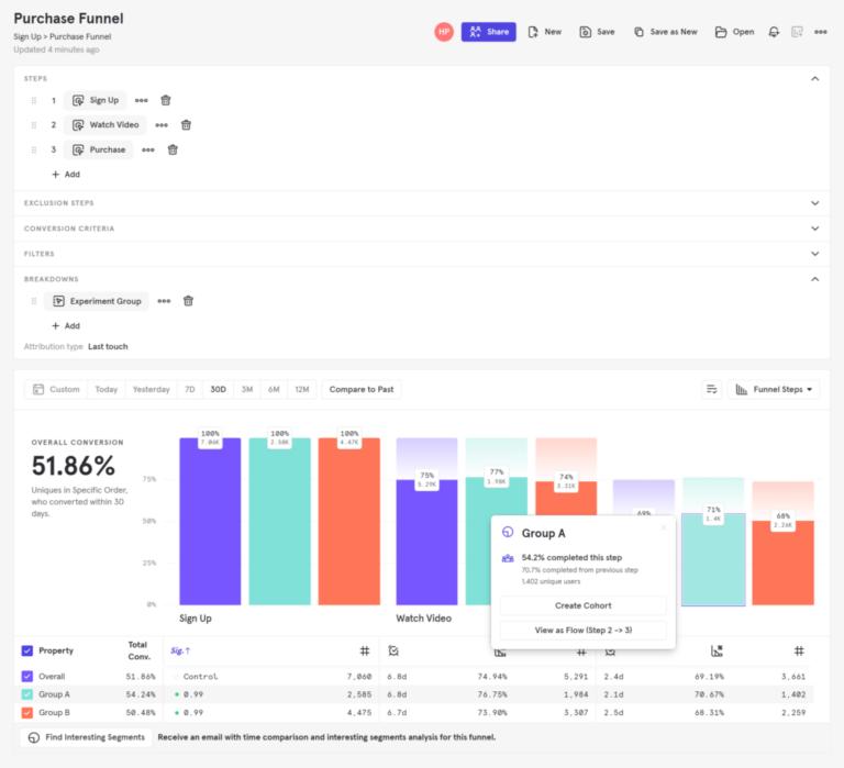
This approach requires two things: tracking the right events and having a platform that makes cohort-based retention analysis straightforward. Using a feature like Mixpanel’s Retention report, teams can define the triggering event, the retention event, and the window, then see the resulting retention curves by cohort side by side.
We've started to look heavily at Week 1, Week 4, and Week 12 retention queries in Mixpanel. We've since realized that community members don't become committed to our platform overnight and instead it takes days or even weeks to build that relationship.”
Once you’ve identified the behavior that predicts retention, every other decision becomes easier to prioritize. Onboarding redesigns, feature development, and marketing messaging all get evaluated through the lens of whether they move more users toward that behavior. With acquisition costs rising and subscription fatigue tightening consumer spend, teams that understand what drives their retention curve (not just what the number is) are at an advantage.
Product analytics = company analytics
These examples share a common thread: The data didn’t just answer a question. It changed what the team did next. That’s the real value of product analytics — not reporting, but decision velocity.
Your data is most powerful when it’s fully connected, from pre-signup all the way through revenue. Marketing data, product data, and business outcomes data need to speak the same language — because the product team’s activation problem and the marketing team’s cost-per-acquisition problem are often the same problem, just viewed from different angles.
That’s why Mixpanel has expanded to include AI feature analytics, marketing analytics and Warehouse Connectors, unifying behavioral data with business outcomes in a single platform. When every team works from the same source of truth, the entire company moves faster with more confidence.
See how your product analytics stack up. Get started with Mixpanel for free.