How to make data-driven design work for you
As creatives, there are few things we hate more than hearing, “Make the logo bigger,” “Put everything above the fold,” and “Make the words pop!”
Whether you’re a product designer, a copywriter, an art director, or any creative role, if you’re good at your job, you have a rhyme and reason for doing what you do—every single time. You’ve thought through all potential angles. You can defend your choices. You can convince someone to back out of their feedback, or even better, help them make the feedback more constructive. But what do you do when you hear, “The data says it’s bad”?
You do better.
In this digital era, everything can be, and if your company is smart, is tested. Google’s Internal Data Report from 2018, as cited by Croud, tells us that 50% more conversions were generated from data-driven creatives. 50% more. It’s hard to compete with numbers like that, no matter how precious your work.
Whether you’re building a better onboarding flow, making updates to your checkout process, or creating the next big campaign, here are three ways to make data work for you.
Test continuously
Working at an analytics company, we have no shortage of data to tap into. When our team launches campaigns, we create the iterations we want to test and see what performs best. For our Guide to Product Metrics campaign, we launched three variations of the same banner ad, each with a different colored background, to see what would get the highest click-through-rate. In a few day’s time, the yellow was the clear winner, and we optimized our ad spend towards it. In the next round, we took the yellow and tested different creative elements like adding in a textured background. These kinds of low-risk, high-reward tests can give you valuable insights to take into future work.

Get feedback, faster
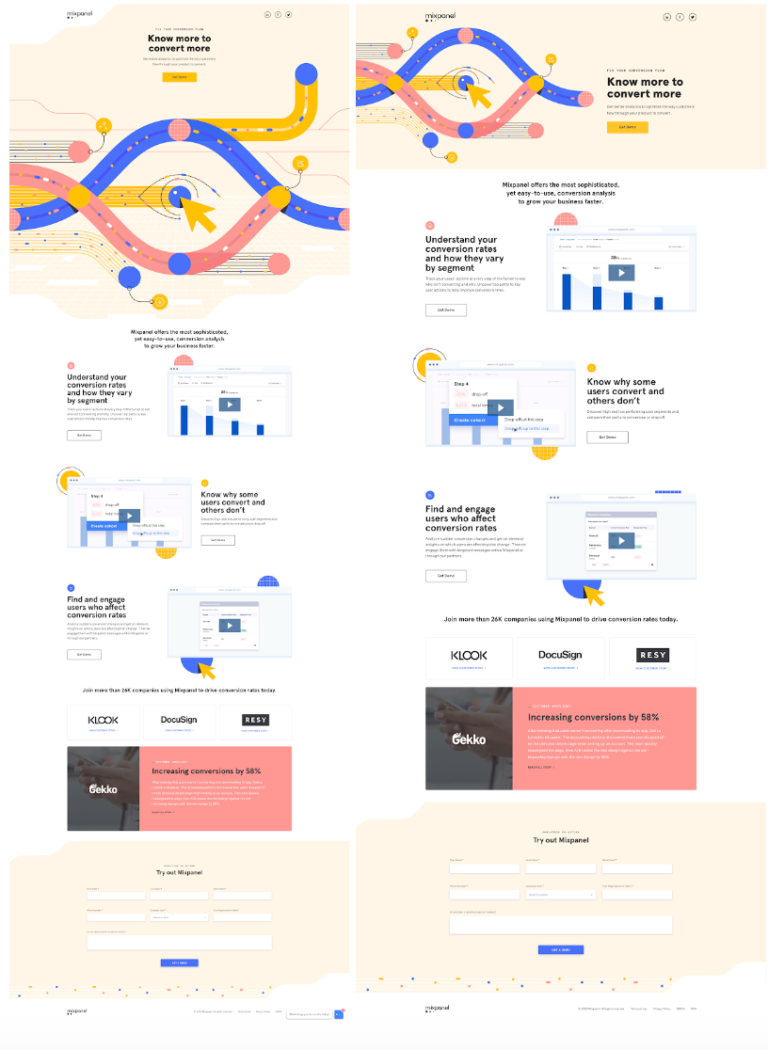
On our recently launched conversion campaign, we had a hypothesis that centering the headline and hero image would help guide the viewer down the page. But we needed data to prove it. So we created a second iteration where the headline and hero were inline at the top, all other elements remaining the same. We had two pages that were on-brief, on-brand, and work we were proud of, no matter the winner. At the start, our control page was the clear frontrunner. But as the test ran, we learned that the variant drove 26% more click-throughs. In just a couple week’s time, our team had the data we needed to optimize our campaign for maximum impact.

Build a strong brand
While data can significantly help your work’s performance, when done wrong, it can also hurt. The pitfall happens when teams go rogue and cobble all the winning elements from previous tests into one Frankensteined “monster” piece. For brands trying to rise to the ranks of Apple and Google, make sure that whatever you’re testing, you lead with brand first. If something you’re testing feels so off the mark from your brand aesthetic and tone, don’t make it. Don’t test it. Don’t put it into the ether. It might prove beneficial in the short-term, but long-term can hurt your brand reputation.
In this day and age, make data your friend. Test what you’re curious about. Align with cross-functional teams from the start so no rogue tests happen. And stay true to your brand. When done right, data can make your already well-thought-out work that much better.
So the next time you hear, “Put everything above the fold,” respond with, “Let’s test it.”


