The only stickiness metric that matters

Early in my career as an engineer, and then, as a product manager, I had the opportunity to be part of the trajectory of iconic products like LinkedIn, Twitter, and Facebook. This was at a time when the internet was fundamentally re-shaping our relationship with technology and software. It still amazes me how much those products have grown—and how many people continue to use them every day.
Today, COVID-19 is once again altering our relationships with the products and services in our lives (in many cases, irreversibly). And while the physical health of our communities is society’s number one imperative, product leaders are finding themselves in a period of new beginnings—or perhaps even in a position to help people in need.
Many of the unique patterns formed now will stick, even as we return to old behaviors when this is over.
In this new era, it’s become even more important to design products that are easy for users to adopt, learn, and extract value from in the future.
I sit on the board of Discord, which has seen a significant increase in usage as people flock there to connect over audio/video calls, and open text chats. Other communication platforms are seeing similar unprecedented growth. For Discord and other platforms, the work they put into reducing friction for new users will pay off in their ability to manage this influx, and serve people in their time of need.
Below, I’m sharing the qualities that define the products that stick around—and the one metric that will help you predict whether yours will too.
What makes great products stick?
1. Their use cases are deeply understood
If I’ve learned anything about the key to building products that last, it’s this:
Deeply understanding the individual use cases of everyone who touches the product, and what “success” means for them.
Take LinkedIn, for example. Back in 2004, we were trying to understand (and simply explain) the use cases we were building for. Along with identifying two very different use cases for users on the platform, we also realized that most people were primarily there for one of them.
- “Find” people who can help you, or your company. This appeals particularly to people in recruiting, business development, and sales, and these users are actively searching their networks daily, if not several times per day.
- “Be found” when opportunity comes knocking. Most people want to be approached for the right job—or at least to entertain a request for their expertise. Before LinkedIn, profiles or resumes weren’t online unless candidates were explicitly looking for a job, so it was hard for employers to find them. But LinkedIn prompted users to build their professional profile during onboarding, which made them “findable”. And most, we found, will respond to useful inquiries from the “finders”.
Our aim was to make the product valuable for anyone who fit into either category. And by encouraging users to build up their network over time, it would become increasingly valuable for everyone.
2. They build loyalty at the outset
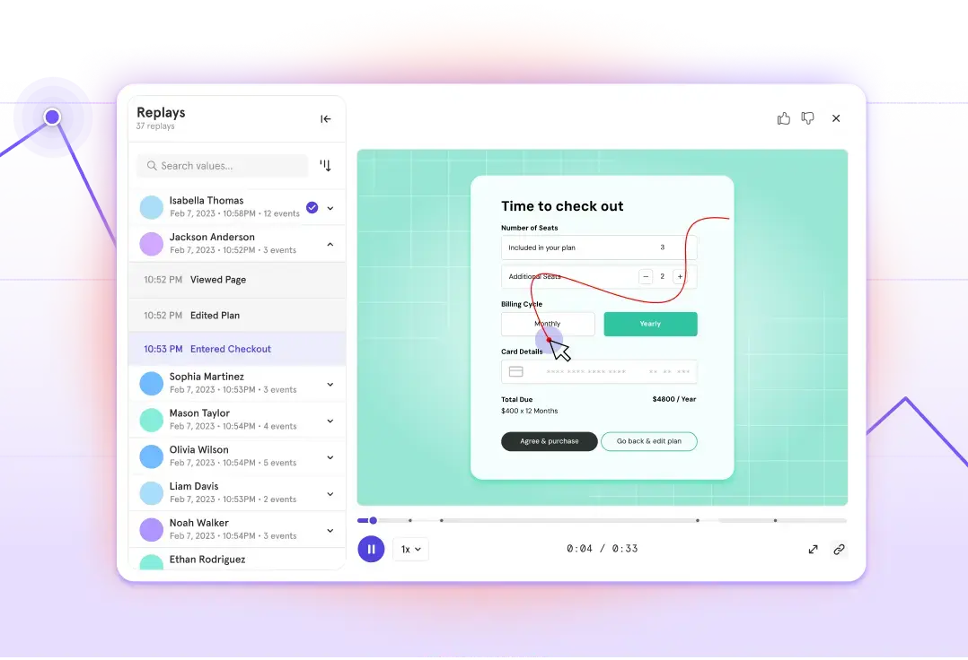
I’ve always believed that the most powerful opportunity to build loyalty with product users is in the onboarding funnel. This is the moment someone is willing to try your product.
You have their attention—don’t waste it.
Here, my advice to product leaders is to think of onboarding as an opportunity to take someone from feeling curious, to possessing core habits. Your goal should be to maximize the predictability that users will want to re-engage with your product.
Onboarding goes beyond the first setup screen, or even the first session—it’s an ongoing process that continues until someone is using the product effectively on their own.
At Twitter, where I spent time as a product manager, we put a lot of care into tweaking the onboarding experience. We knew that unless users had a timeline they found valuable, they wouldn’t be compelled to come back regularly. So we nudged them to personalize it.
Today, meditation apps like Headspace and Calm are becoming lifelines for a lot of people, but the practice of meditation may feel out of reach for some.
The opportunity here lies in onboarding users to the idea of meditation itself—simply explaining what it’s about is a chance to convert a semi-motivated person into a dedicated user.
3. They give users a reason to come back
Even after loyalty has been established, it’s important to occasionally nudge users to come back. I encourage product builders to harness the right “moments”, or triggers, that can prompt people to return, and engage on their terms.
This can take one of two forms:
- Time- or event-based triggers: take advantage of moments in time or events in the real world to remind people your product exists. For example, eCommerce companies may sometimes say, “The holidays are coming up—have you shopped for that special someone yet?”.
- Product-based triggers: sometimes, there’s enough activity happening within the product that you can leverage the information to bring people back. For example, social media apps might say, “Your friends posted 10 new videos—come and check them out!”.
The takeaway? From onboarding to re-engagement, your objective should be to get (and keep) users interested for reasons that align with the intrinsic value of your product.
The only stickiness metric that matters
This brings me to what I consider the core of any product strategy:
The answer to the question: “how many people are really using my product?”.
As a builder turned investor and advisor, I’ve learned that it’s easy to get lost in numbers that can fake you out—things like clicks, downloads, DAU.
But at the end of the day, your job is to focus on what these numbers tell you about users who are most likely to stick.
For example: if a gym tracks signups, they might think they’re in good shape (and in January, incredibly good shape). However, if they were to instead look at how many people are signed up for an annual membership, it tells a very different story—one that has a real risk that many of those people will not renew. Now, they might have to expend precious resources on attracting a whole new crowd of gym-goers, when all along they should’ve had their eye on nurturing engaged weekly users, and using that as an indicator of future success.
When it comes to building products that endure, product leaders simply must be confident that people will be engaged in the next week, month, or year.
Going one level deeper, the question becomes:
“How many times did users perform a core action on the expected cycle?”.
In other words, at what frequency are they viewing content, finding a job, or—in better times—booking a night’s stay?
Connecting the dots
Data, while essential, can cause us to think in averages rather than individuals. But every data point represents a person, and tells a story about how they’re interacting with your product.
Think of data as the plural of anecdote.
It’s nice to be able to say that you once had a 28 percent conversion rate, and you increased it to 32 percent. Progress! But really, 72 out of 100 people used to not convert to the desired action, and now, 68 people still don’t.
Ask yourself: what’s the most impactful thing you can do to make those people feel compelled to stick around?
Lastly, remember that while products need users to be successful, the stickiness metric is not the same for every business. The most impactful product decisions are the ones that tell the right story for your product. Just because it worked for LinkedIn, doesn’t mean it will for you.
Talk to customers. Understand the way the product fits into their lives. Don’t lose sight of the individual users that form your data.
What story are they telling you? Your product’s future success lies in the answer.
About Josh Elman
Josh Elman is a product leader who loves building products that people use. He helped build some of today’s most influential technology products, including Twitter, Facebook Connect, LinkedIn, and most recently, Robinhood. Today, Josh is an advisor to several companies, and sits on the boards of Medium and Discord.