


How to use Mixpanel to get closer to data democratization

If you want to leverage data to generate great insights about how customers are using your product, getting that data into a product analytics platform like Mixpanel is a huge and important step. But it’s not the last step.
What’s often overlooked are the extra measures it takes to ensure all your data, once it’s collected, is optimized and organized in a way that makes it accessible to as many people working on your product as possible.
In this article, we’ll dive into what an ideal data structure looks like in the event-based analytics context that is Mixpanel, how applying this data structure helps every analyst (of almost any level) to leverage the full potential of Mixpanel’s powerful querying engine, and how this results in greater chances to turn data into optimum insights. In short, this article will help you democratize your data by making it analysis-friendly.
What’s in a name?
Let’s jump in. The center of any attempt to make data more accessible or democratized is, as we’ve teased above, the structure of that data. And at the center of that is structuring, naming, and properties. This is just as true in self-serve-friendly data tools like Mixpanel.
The best way to explain why is by illustrating it.
The query shown below is dealing with Mixpanel event data that is decidedly not well-structured. As a result, you’d think, just by looks, that what we’re trying to get answered here is some very complex data question.
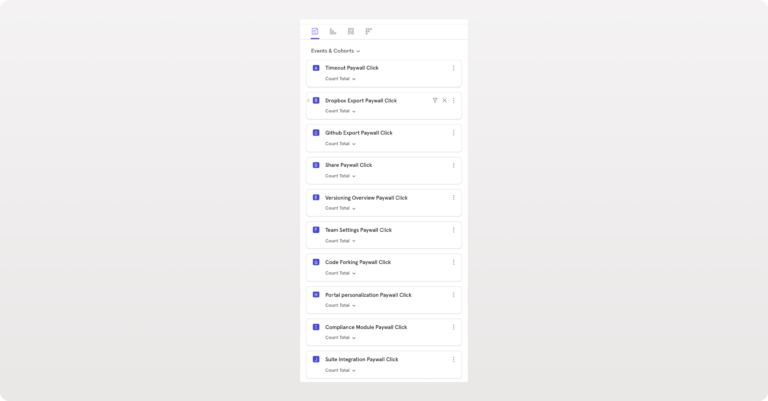
However, that’s not the case. The query is trying to answer a simple question: “How many users clicked a paywall?” It’s not the question that is complex, it’s the underlying data structure that makes answering this question hard and complex.
Let’s look closer at the data naming and (lack of) organization in the example above to pick out the problems.
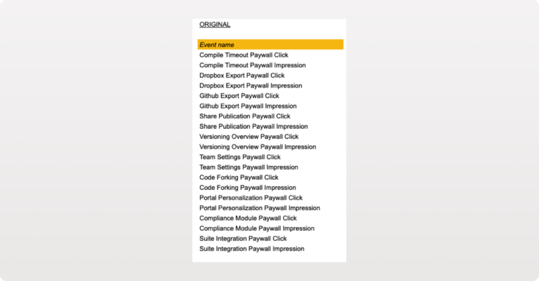
The following table shows 20 events from the tracking project. All of them are either specific “Paywall Click” events or “Paywall Impression” events. And note that no event “property name” or “property value” fields are being used in any of the events.
The reason we get a long, complicated query from just trying to answer “Which paywall do users click the most?” is because of these limitations of our data structure:
- It includes 10 different events that each hold part of the information—i.e. half of the events are “Paywall Click” and half are “Paywall Impression”
- It requires us to sum all these events individually
- It makes us break it down by event name at the end
That all translates into two friction-causing requirements for analysts:
- A great understanding of the complicated underlying data structure—i.e. knowing there are 10 distinct events
- Roughly 11 clicks
What analysis-friendly data looks like
Let’s now have a look on how we can rename, add important properties, and reorganize the events in this tracking plan to democratize the access to our data.
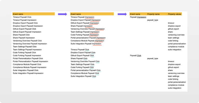
First, we’ll sort the events into two categories. We can clearly distinguish a number of impression events and a number of click events. There are 10 of each, to be precise.
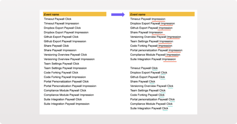
The next step is to actually rename the events and make maximal use of the structuring opportunities that event-based tracking provides, namely the use of properties.
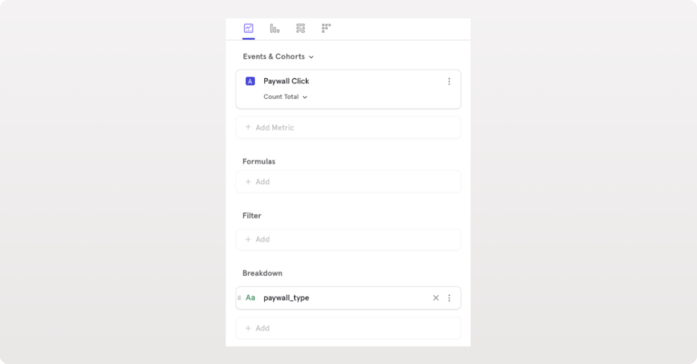
We do this by turning the 20 unique events we started with into two unique events: “Paywall Impression” and “Paywall Click.” Each has only a single property, “Paywall Type,” which can contain any of the 10 values indicating the particular paywall type.
Now let’s revise how this would impact the way we answer the original question: “Which paywall do users select the most?” Using the optimized data structure, this would require the analyst to:
- Select a single event: “Paywall Click”
- Break it down by “paywall_type”
This means that answering this request requires just two clicks, which is nine fewer than when we were using the previous data structure. More importantly, we’ve eliminated a lot of risk while compiling this query. In contrast to the previous version of our plan, this plan does not require us to know how many other click events exist as everything is nicely rolled up in a single “Paywall Click” event which can easily be broken down.
Why analysis-friendly data matters
Why does all of this matter? There’s two main reasons why this type of optimization is very important:
- Analysis-friendly data helps to democratize data. It basically means that lots of different people can be onboarded to Mixpanel and play with the data. As the data is intuitive and almost self-explanatory, the risk is being reduced due to an optimal data structure, and non-technical profiles can help to dig for insights. The more people can be onboarded, the bigger your chances to find valuable insights. Moreover, it also means that Mixpanel can turn more members of a team or organization into productive analysts. It can be opened up to designers, UX specialists, A/B testers, marketers, and even sales teams to fuel their day-to-day operations and long-term roadmaps.
- It’s not about getting results in fewer clicks. Well, not literally. It’s about reducing the risk of making errors. You can think of the number of clicks as being a measure of complexity, and thus risk. Every manual intervention, such as adding an event in order to build an exhaustive list of possibilities within the scope of your analysis, represents a risk. Our question of “Which paywall do users click the most?” required the analyst to sum not seven events, not eight or nine, but 10. Exactly 10. Not doing so would ruin the entire analysis, potentially without the analyst ever realizing. As a rule of thumb, we can say that the number of clicks you’ll need in order to conduct an analysis in Mixpanel says something about how analysis-friendly your data is.
The relationship between democratized data and data-driven product development
In this article, we have focused on ensuring that the data-collection layer fosters data democratization by optimizing the tracking plan. This is only the first step in the data-driven product development process.
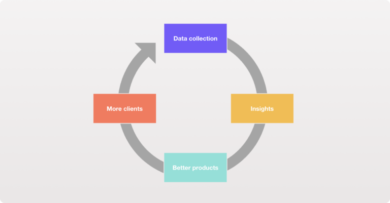
However, it is a vital step to maximize your chances to derive insights from the data. Analysis-friendly data reduces the risk of errors and democratizes the data as such. This, in return, increases your chances to derive meaningful insights from your data, which can be used to build a better product and make your business grow.
Everything starts with a solid foundation. And in the case of Mixpanel, that is a well-thought-through tracking plan that makes data analysis friendly.