
Why designers should love (not fear) product analytics

When asked if they use or are comfortable with product analytics, most designers I know look away like a dog caught eating a whole jar of peanut butter while their owner was out.
Part of the reason why this tends to be the case is because of those two words alone: Product. Analytics.
If either word enters the conversation with designers, you might as well start talking about artificial intelligence, crypto, NFTs, or any other topic with a deep breadth of technical intricacies.
But if we talked about product analytics in a more human way, fewer designers (not to mention other types of less technically inclined roles) would be scared away from using it to help them make much better, and faster, decisions that ultimately lead to a better product.
I come bearing this take not just as a member of Mixpanel’s design team, but as a designer who is a full-fledged product analytics user and advocate.
Allow me to explain…
The practical use of product analytics (in design and beyond)
Product analytics isn’t here to give you answers; it’s here to give you various kinds of quantifiable information as fast as possible. What you do with that information is ultimately up to you.
It gives you things that qualitative data can’t, but it also leaves out some other things that only qualitative data can inform. Neither is better or worse than the other, and, in fact, the two types data often work together.
For example: Many of the answers you get in quantitative studies are strictly objective numbers (often large in volume) that can help you make decisions about issues that may never arise without being dug up in qualitative studies.
The bottom line is that tools like Mixpanel are here to help you get information you’d have to spend a ton of time interviewing customers to get, just by studying what people are actually doing in the product.
I’ll give two real examples of how I’ve used Mixpanel in different ways to make design decisions.
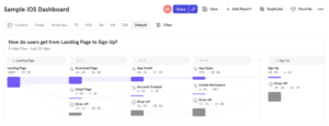
Getting Flows into the Dashboard
Our design team knew our customers wanted Mixpanel’s Flows report feature (which helps people understand the sequences of the actions users take within their products) in their Dashboards. However, it wasn’t built for that environment. We had plenty of customer interview data, but I didn’t have a bunch of “boring” quantitative information that was super pertinent to the design, such as (but not limited to):
- How many steps do people typically have in a Flows report?
- How many anchor events do people typically have in a Flows report?
- How many cohort segments do people typically have in a Flows report?
- Do people typically add steps before or after their anchor event?
- What’s the cardinality on most Flows reports?
- How many breakdowns are people using on their Flows reports?
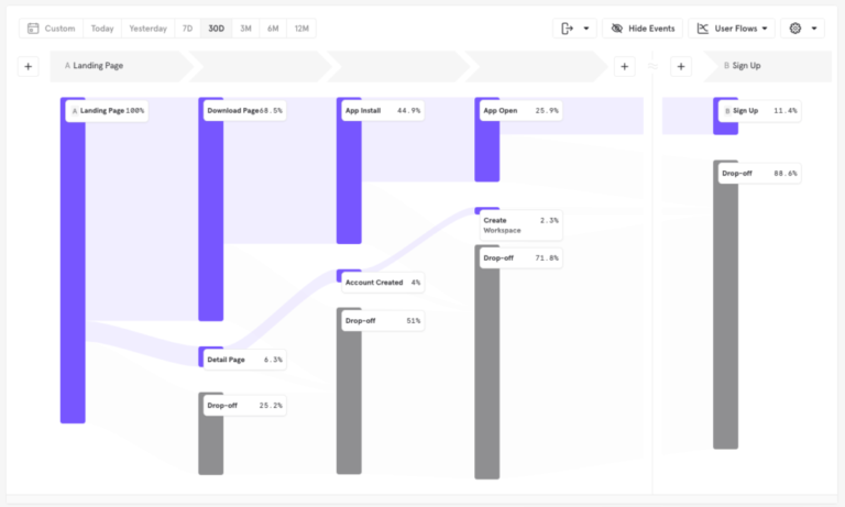
It would take a ton of time to conduct interviews with customers to answer these questions—probably months to interview, compile, and hope that the information is correct. But in the end, it’s all numeric information that we can determine fast and easily with Mixpanel.
It’s super easy to figure that out with a report like this:
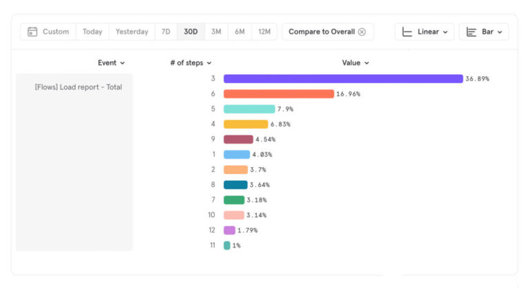
According to our data, most folks are using three-step reports. After that, the next most popular setup is six, but maybe my edge is 10 steps to consider. Design-wise, the difference between 10, 12, and 11 is kind of a negligible problem. If I solve for 10, 12 and 11 are solved with it. But my most common use case will be three, followed by six steps. Now I know where my edges are for the number of steps to visualize. That’s a useful design constraint!
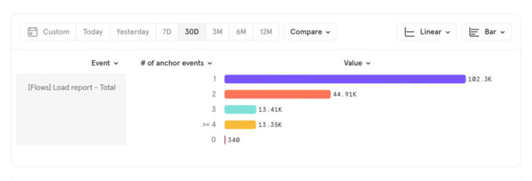
We looked at the number of anchor events used, and typically there’s only one. But some folks are using two or more. So it’s certainly something to account for.
These type of questions are a really great use case for designers using tools like Mixpanel because it helps paint a picture of your boundaries by doing nearly instant quantitative research.
If I asked you what the cardinality of your Flows report tends to be in a user study or interview setting, it would almost certainly be more hand-wave-y and guessing than true.
As a designer, trying to determine how to make this wide and tall report function in a 320h x 240w card size, we had to figure out what our real edge cases were and what was most typical statistically. From those queries we ran, we found numeric answers we could design from and edge cases to consider.
The answers to these questions lead us to the design you see below. We were able to save some space by removing containers and bringing more numeric information forward without requiring tooltips or further user interaction, all while considering the features customers use most.
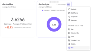
Multi-metric cards
Another visualization we recently designed for dashboards was the Metric visualization. This report was difficult to design for a number of reasons, but here’s a few off the cuff:
- It currently only existed in Insights, but we wanted it to exist for nearly every report.
- It would always tell you the
Topmetric, which made it challenging to control. - If you wanted a number of metrics from the same report, you’d have to create multiple similar, but different reports and then add those to your dashboard.
We discussed the modifications we’d need to make to each report if we stuck with the existing “Top Events” behavior, but they would all be different depending on your report. And the interaction required would have also varied—making a familiar request and unfamiliar interaction through each touchpoint.
By creating a multi-metric visualization, we could enhance an already familiar interaction pattern simply by making the metric card support the same kind of variables as the other chart visualizations. All of the behaviors and controls would match. And we’d be enhancing the behavior and control you had on the metric card conceptually, so it seemed like a pretty solid improvement for our customers.
We tried doing some qualitative questioning, but it didn’t really get us anywhere because, to quote Henry Ford, “If I had asked people what they wanted, they would have said faster horses.”
With or without asking our customers directly whether they wanted a multi-metric card, it would be challenging to receive a productive answer, because the problem we were solving was indirect to the customer’s problem and more holistic. It’d be like asking them if they wanted capacitive touch on their first iPhone. “What is that? Why would I need that? Does it make phone calls?” We’re basically asking them the same thing, through the woods of a myriad of questions behind the scenes. If I asked, “Do you want a multi-metric card?” I would expect, “Multiple metrics on my dashboard? No. I can already do that like this.” And then they’d show me how they duplicate a report, add a filter, save the card, add it to their Dashboard, and repeat. Technically, it’s possible. But I wouldn’t have called it intuitive. It’d be like painting in Excel. Can you do it? Sure. Should you? I mean…up to you. But it’s not intuitive.
Our solution is really clicking a checkbox to turn a multi-metric card into a multi-metric card immediately—across any report that supports it.
No customers were asking for a multi-metric card because it wasn’t an obvious solution to their problem. They wanted to be able to put metrics on their dashboard, and they were familiar and comfortable with the current function and workflow to do it, but it’s a process that would be strange to a new user.
We explored and ultimately delivered a multi-metric card across the majority of our reports and were able to measure the success of delivering that feature.
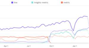
You can see using the line (purple) chart as a baseline, while our prior metric card (red) was well used, but relatively stagnant, we saw an increase in use of our new multi-metric card and saw it increase in usage compared with the baseline we have of last year’s “top metric” card (red dotted line). So, at the very least, it’s safe to assume the new feature is meeting expectations, and it’s optimistically safe to say it’s outperforming expectations of a 1:1 feature match.
Product analytics is like any other tool. You don’t use a hammer every second of every day, but it’s certainly easier to drive a nail into a wall with a hammer than the heel of your shoe. User studies are great, but they’re not everything. Product analytics is great, but it’s also not everything. Intuitively designing is great, but it’s not everything. But once you combine all of those tools, you’ve got an idea of what you’re doing and so do the people using the products you build.
Designing with data leads to better decisions
At the end of the day, what product analytics really lets you do is quickly discover and understand information and trends about how people are using your product. Armed with this, you can make better design decisions—including on things you typically wouldn’t bother to ask a customer about because you don’t have the time and, frankly, they aren’t excited to answer. And Mixpanel puts all of the above just a few clicks away.
The product analytics industry is changing rapidly and its language and ideas will become more accessible and approachable, allowing more people to make better design decisions. So while product analytics may have been intimidating in the past, we’re working hard to break down those barriers and increase access across the board.