

Data monitoring vs. data analysis: Why ‘dashboarding’ will only get you so far

Too many companies confuse data monitoring with data analysis.
As a data strategist and cofounder of Human37, I help companies use data personalization to build better experiences for their users.
A lot of times, we get new clients who aren’t new to using some data in their workflows but want to take the next step in getting better insights to improve their products and businesses. These companies are usually monitoring the business data and North Star metrics their data teams have put together in business intelligence (BI) dashboards—tools like Tableau, Looker, or PowerBI—which give everyone a snapshot of overall product or business health. That’s great; it’s what those dashboards are for.
Where these companies run into problems is when their various teams mistake this data monitoring—or “dashboarding,” as I like to call it—for analysis. They think the answers for how to improve the metrics in their dashboards will show themselves after enough clicking around.
“Dashboarding” is limited
You can’t answer a very complex question in a single dashboard or a single chart. It doesn’t matter how many filters on top of filters and slices of the data you make. You end up with a Frankenstein dashboard and no valuable, actionable insights.
Doing this is a misunderstanding of what dashboards are for.
Dashboards are not analysis tools. Dashboards help you monitor KPIs that you have determined are important for your organization. They can confirm what’s working or give you an early indication that something is wrong.
What they can’t tell you is why.
If dashboards are a snapshot, analysis is a process. And when companies use dashboards incorrectly, they miss out on the deeper, more valuable analysis.
From analysis to better products
So what’s the alternative to “dashboarding”? Here’s what we help our clients do instead.
(A hint up front: Analysis processes like the kind we endorse are made much easier with a self-serve analytics tool like Mixpanel.)
Step 1: Start with a hypothesis
Improving a product should always start with a hypothesis. We make an assumption about what the user wants, and we gather data to validate or disprove it.
From that data, we can draw conclusions and define which key performance indicators (KPIs) to monitor.
Finally, we add those KPIs to a dashboard, where we can track their performance and report on progress over time. It looks like this:
Hypothesis → Analysis → Conclusion → Define KPIs → Monitoring & reporting on the KPI
Let’s say I have an idea about my product’s user onboarding.
Hypothesis: I believe that customers who make it through onboarding become higher-value customers once they complete it because they get more value from the product.
Analysis: To validate that hypothesis, I will analyze the data I have by comparing two groups: those who complete onboarding and those who don’t.
Of course, getting this information requires running and comparing two different reports or maybe even running data to an AB testing solution. A tool like Mixpanel makes ad hoc reporting (and ad hoc analysis) like this possible for almost anyone on any team to build.
Conclusion: If those who complete onboarding see faster time to value (TTV), my hypothesis is probably correct.
KPI: With that information, we have our KPI to monitor—the percentage of users who complete onboarding. We'll add that KPI to our dashboard and track its progress over time.
In this example, the conversion funnel we want to monitor would be:
User signed up → Onboarding started → Onboarding completed
Monitoring: If that KPI goes up, we know that our hypothesis is right. If it goes down, we need to dive back into our analysis and understand what’s happening. (More on that next.)
Step 2: Use analysis to improve your product
When you’re building a hypothesis, it can take several tries before you get it right. You might need to test and disprove several theories before you find one that fits.
The key is to treat analysis like a cycle:
→ Insights → Hypothesis → Analysis → Insights → Hypothesis → Analysis → Insights →
Take our onboarding example from earlier.
If we had compared the two cohorts (those who completed onboarding and those who didn’t) and found no meaningful difference in time-to-value, our hypothesis that onboarded users get more value from the product would have been disproven.
We would have gone back to the drawing board, formed a new hypothesis, and gathered data to validate or disprove it.
Even when a hypothesis is correct, we’ll still want to keep going deeper into the data to uncover more insights and use those insights to optimize our product.
To do that, we not only need to be able to create reports on the fly but also look into granular details of particular user events. These are all things that Mixpanel, with its event-based data model, supports really well.
Doing analysis requires the right tools
I’ve mentioned that Mixpanel makes data analysis easier. Let’s get into exactly what that looks like.
Back to the onboarding example again…
Now that we’ve determined users who complete onboarding are more valuable than those who don’t, we want to learn more about those users’ behaviors.
To do that, we’ll look at all of the people who have completed onboarding in the last 90 days.
Our onboarding funnel in Mixpanel looks like this:
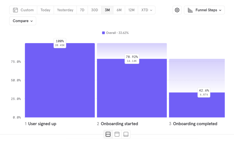
When we plot the distribution, we realize that 50% of people went from step 2 (Onboarding started) to step 3 (Onboarding completed) in under four and a half minutes.
That’s an insight that’s very hard to get in other tools because in Mixpanel, we can see timeframes for user behavior.
From that insight, we can formulate a new hypothesis: Users are more likely to complete onboarding if they can do so quickly.
If we can make onboarding even faster, more users will complete it and get value from our product, ultimately becoming more valuable customers for us down the line.
With these insights, we challenge our team to make onboarding smoother so that users can complete it in under four minutes.
Conversions increase to 55%.
When we look at the data again, we see that 70% of users complete the onboarding on mobile, where attention spans are shorter. We want to optimize for those users, so we decide to aim for even shorter onboarding at 3.5 minutes. Conversions reach 60%.
Analysis is an ongoing process
It’s easy to see in the example above how digging deeper and pushing your analysis further can yield more and more insights. This kind of ongoing analysis is made possible with self-serve analytics.
Teams that learn to always be in the mode of asking questions of their data can move faster toward making informed product and business decisions. And that, not just monitoring or "dashboarding" data, should be the goal.