How teams of every size can build products like Google
Most companies didn’t make 89 billion dollars last year. Most companies didn’t employ 72,000 people in 50 countries or have seemingly inexhaustible executive support for one-off projects. Most companies won’t ever manage to become a household name synonymous with innovation or generate the kinds of returns that Google does. Yet many build incredible products anyway.
Since 2009, we’ve had the luxury of helping tens of thousands of companies in every industry track their data. What we have witnessed has validated the belief that this company was founded on: that data helps teams of every size achieve better results.
Data paints a rich portrait of who uses products and why, allowing both startup and enterprise teams to prioritize better and develop a clearer focus. When paired with human-centered design – the art behind the science – data becomes a fulcrum with which product teams can move the world.
Here is how they do it.
Invest in empathy
Human-centered design is built on the belief that the people who face a problem hold the key to its answer. This simple idea has profound implications.
It suggests that product teams, despite their wisdom and experience, will often make the wrong decision for their users. To make the right one, product teams need to leave the office so they can meet and begin to understand those they serve. While most product managers readily agree with this in principle, they don’t often in practice.
It’s not entirely their fault. Product teams have to fight the inertia that keeps them tied to their desks. Exclusively using online resources seems economical, especially when designing digital products. More times than not, workplace hubris is also at play; that is, it can feel seductively simple to rely on intuition and experience alone. Plus, it’s free.
“Every dollar is a fight,” says Vincent Feeney, a UX designer at accounting software company MYOB, “and spending 25 percent of the budget on ‘just talking to people’ can be a hard sell.” Yet there is no substitute for the depth of insight that can come from in-person conversations. User interviews help product teams uncover insights they couldn’t discover on their own.
User interviews are how the product team at healthcare app Oscar realized that rather than increase usage, they should try to keep users out of their app. Interviews are also how Warby Parker started offering in-home trials, how WeWork realized that it should focus on community, and how Soulcycle finally realized that it should expand to fitness beyond cycling. For many innovations, users hold the key.
Commit to outcomes and get scrappy
True human-centered design requires teams to shed their hard-won preconceptions, admit to not knowing, and commit to a mindset of perpetual learning. It’s only with this devotion to outcomes that teams are able to, as the author Arthur Quiller-Couch put it, “kill their darlings” and accept alternatives that lead to better outcomes – even wacky ones.
Google’s Project Loon was named such because it sounded looney. But what began as a joke proved to be the most viable method for offering high-speed internet access to areas without infrastructure. Only a truly ego-free product team could have chased helium-filled party balloons carrying WiFi devices around California’s central valley to realize this. After the hurricanes of 2017, a fully developed Project Loon now provides internet access to devastated areas of Puerto Rico.
Sure, Google has resources that most companies can only dream of, but teams of all sizes can achieve the same results by getting scrappy. Aryn Shelander and Matt Aronoff, founders of Logical Animal, formerly of the product team at Weather Underground, have uncovered critical user insights using only cheap inkjet printouts.
“We needed user feedback on our weather app, but formal methods had too much process and associated cost,” recalled Aronoff. When it occurred to them that their office building was full of other tenants, they eschewed formal testing services and took the stairs.
“I won’t lie, at first it feels super awkward to stand in a hallway on a floor in someone else’s building waiting for someone to walk out of a bathroom so you can ask them questions,” said Shelander, “But it’s worth it.” After approaching a handful of people who, in turn, asked their friends and co-workers, the team at Weather Underground built a sizeable email list of potential users.
Right before a major redesign, they put their building-mates to work. Internally, the team preferred a circular map design, but Shelander insisted on testing it against a rectangular one. One by one, the volunteers trickled into the lobby to see the paper prototypes and indicate their preference. The rectangular version won by a landslide.
“The insight we gathered was invaluable,” recalled Shelander. “It didn’t take money, just guts.”
Make diversity a way of life
Diversity is also a powerful yet largely overlooked pillar of great design. “Most people build the products they want for themselves,” says Mina Radhakrishnan, entrepreneur and former Head of Product for Uber. “The more identities, backgrounds, and experiences represented by founders and product managers, the more problems solved.”
Research from McKinsey, Deloitte, and Harvard corroborates her idea and points out that diversity goes beyond gender and ethnicity. Diversity in age, religion, height, interests, nationality, and all manner of experience are important. For a team to think like users, users’ identities have to be represented on the team.
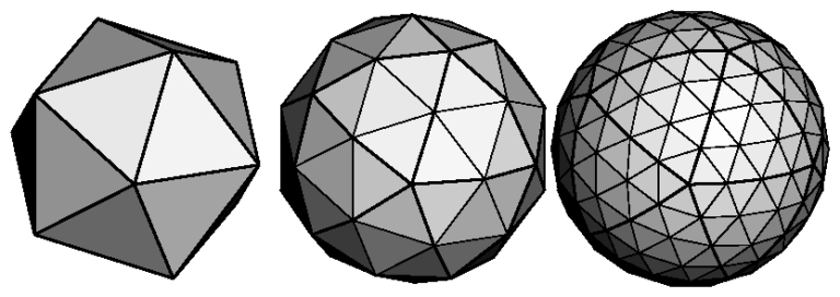
One way to think about it: if a team trying to design a ball, and each team member’s perspective is another surface, it will take a lot of perspectives to make the ball roll. The same is true of most products.

Photo courtesy of OpenGL
The more diversity, the more errors and assumptions teams can catch. At Uber, Radhakrishnan recalled, “I put buttons on an app that had the same color and it took someone who was colorblind on the team saying something for me to realize that many of our users couldn’t distinguish the yes button from the no button.”
Shelander recalls similar insights from her time at Weather Underground. Despite using a translation service, her multilingual colleagues would catch errors in the French or Hindi translations of the app that the service wouldn’t. In a similar vein, international employees noticed that no matter the country, the map would often mistakenly revert to San Francisco.
Shelander’s team eventually changed the app’s forecast graph to continuous scroll after receiving a tip for one of their UX designer’s husbands. Because he had a job plowing snow at night, he found it frusturating that the graph paginated at midnight. Now, he can see the forecast before and after midnight at the same time, making the app much more useful to him.
Spending time with their families often helps product team members catch flaws. “I realized that my grandfather, who loves radar, was unable to use my app because his fingers were too jittery to tap the small buttons. It just about broke my heart,” said Shelander. She immediately enlarged the tap target size of the map controls.
Use analytics to understand user behavior
Teams with a commitment to empathy, outcomes, and diversity can verify their human-inspired design changes with product analytics. Did users react well to the latest release? Was the sample group’s preference true for more than just that user persona? Is what users ask for consistent with what they engage in?
It is not uncommon for users to say one thing and do another. In 2013, Al Jazeera, the Qatari news organization, asked Americans if they preferred factual news over ‘entertainment’ news. Research subjects overwhelming said yes. But after investing over one billion dollars in launching an American news channel that delivered hard-hitting news, the company failed to find an audience. Americans actually wanted entertainment.
With product analytics, teams of any size can avoid Al Jazeera’s error. They can easily parse their data to see when users’ stated preferences are merely aspirations by looking at their actual behavior.
Machine learning-equipped analytics tool can help product teams can detect issues like this automatically at scale. These algorithms are designed to mine vast tranches of user data, surface insights, eliminate human error, and alert teams to growing problems. The team at Go-Jek, dubbed the Uber of Indonesia, was alerted to cross-device usability issues which inspired them to improve their entire design process.
Product teams can also automate their tracking of acquisition and retention. The team at Wistia uses analytics to identify and cater to a cohort of their most valuable users. Similarly, the team at the ride-sharing app Lyft relies on analytics to understand what happens on the 350 million rides their users take each year and then rigorously test changes in their rider and driver apps.
With the data laid bare, teams of any size can experiment, learn, and capitalize on other user-informed revelations. And with product analytics to collect and refine billions of data points, they can behave like large, well-resourced organizations.
Armed with a human-centered design approach and the data to verify it, product teams can punch far and above their weight. If they are scrappy, diverse, and data-driven, they often have all they need to build incredible products. And best of all? No Googleplex needed.

