Lifecycle analysis to understand your users
Every product or service has a core purpose it serves for its customers. For a ride-sharing app, it may be to get users from point A to point B; for a video platform company, it may be to let users search, browse, and watch videos.
Product teams at these companies typically track the number of “active users” over time, which is just the number of users who perform some key action to experience the product’s core purpose at some frequency in order to assess engagement and overall health of the product.
But, not all users are created equal. Segmenting users into different groups and tracking their movement between different engagement states is a great way to get a deeper understanding of your users and find opportunities for further growth.
This blog post will cover 2 kinds of segmentation analyses you can run to help you understand your users better.
- Lifecycle analysis: breaking down your active users into new users, retained users, and resurrected users to understand how your user base is growing.
- Engagement segmentation analysis: segmenting users into “core” and “power” users, and understanding how users move from one state of engagement to the other.
For the rest of the post, let’s take the example of an online video platform that is tracking users who perform their key action of “watch video” on a weekly basis, and run these two analyses.
Lifecycle analysis
One of the most common metrics tracked by product teams is user growth, but visualizing user growth without understanding how this growth is happening can be dangerous.
Let’s take a look at the trendline of weekly video watchers during a 10 week period for an online video platform:
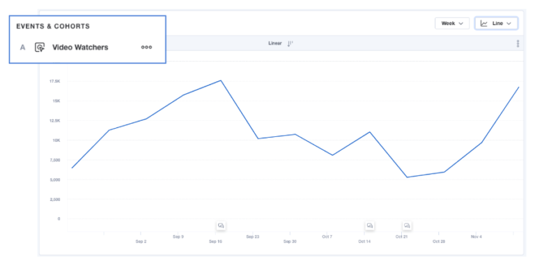
You can tell from looking at this graph that there’s a steady rise in weekly video watchers until a dramatic drop between the weeks of Sept 10 and Oct 21, and another steady climb back up. What this graph doesn’t tell you is why we see these trendlines.
Is the climb due to the user base growing from new users? Was there a product update or a marketing campaign that reengaged previously inactive users? Are there fewer new users due to ineffective marketing that caused the drop?
Lifecycle analysis,sometimes referred to as “growth accounting,” is a way for companies to answer these more meaningful questions by digging deeper and breaking down active users into its parts that make up the active user calculation: new users, retained users, resurrected users, and dormant users. By breaking up the active user base into these groups, it helps to reveal what exactly is contributing to the growth (or shrinkage!) of your user base, and helps teams build more sustainable user growth.
Let’s quickly define what is a typical definition of these user groups. (Note: the exact definitions could vary for different businesses.)
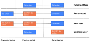
Now, let’s plot the active user base broken down into new users, retained users and resurrected users to see how the changes in each user segment contributes to the overall active user base:
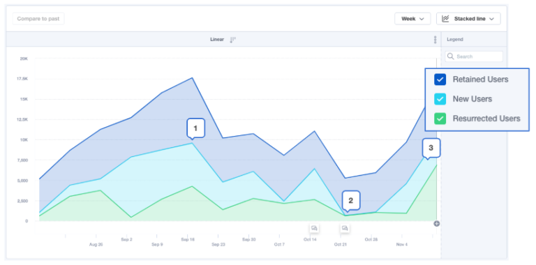
Now that we can see the breakdown of the different user groups, we can now start to understand what contributed to the rises and dips in the original weekly video watchers graph.
Looking at this enriched graph, we can tell that:
- New users have steadily been declining since September through October
- The drastic fall in new users between October 21-28 is what drove the big overall dip in active users
- Resurrected users grew by 600% between November 4-11 that contributed to overall active user base growth
With these insights, you can now dig deeper to understand:
- What happened to new users in October? Was there a change in marketing campaigns? A problem with sign-ups or onboarding?
- What led to a 600% increase in resurrected users in November? Was there a product update or a marketing push? How can I replicate this or keep this up?
Looking only at total active users without any segmentation to account for the different types of users you have, it doesn’t provide the full picture to help you answer the age-old question: “what happened, and why?”
Lifecycle analysis, like the one we just went through, helps you account for the different journeys your users experience based on their usage and engagement with your product and helps you uncover what moved the needle or caused a drop in terms of user base growth.
Found this valuable? Here’s how to get started with lifecycle cohort analysis in Mixpanel.
Next, let’s talk about engagement analysis and how users move from one state of engagement to others.
Engagement segmentation analysis
As mentioned earlier, all users are not created equal — even the ones performing your key action on a weekly basis.
In our online video platform example, some users might log onto the platform once a week to browse the catalog and watch 1 or 2 videos, while some have already made watching videos on your platform a habit and watch dozens of videos a week.
Let’s imagine that our video platform is an ad-supported platform. One of our key metrics might be to increase the number of video plays per user because that leads to more ads being seen, and therefore more revenue. In this case, our users watching dozens of videos a week are much more valuable to us than users only watching 1 or 2 a week, and we’d want to understand how users move from being casual watchers to habitual watchers.
Engagement segmentation analysis, helps us do exactly that. Where the lifecycle analysis report helped us understand user base growth for weekly video watchers, in this section, we’re going to look at how we can calculate the rate at which users move from a low state of engagement to higher states of engagement to help us understand how effectively we’re converting users into high-value users.
Let’s start by defining the 3 engagement states that we might use as a video platform company:
- Occasional watchers: 1-2 video watches a week
- Core watchers: 3-10 video watches a week
- Power watchers: 11+ video watches a week OR 1+ video uploads a week
Power watchers is currently the smallest group, but they are also the best kind of customers since they’re watching the most videos per week and contributing fresh user-generated content to our platform. What we’d want to know is how effectively we’re able to turn occasional and core watchers into power watchers.
Using Mixpanel, you can track this movement of users, let’s say Core to Power, as metrics over time:
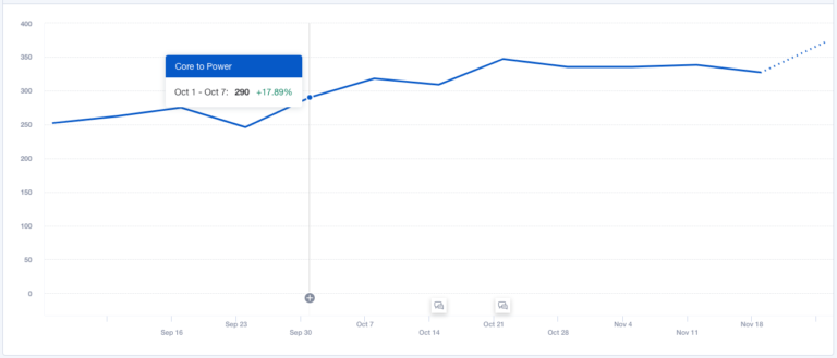
What we see here is a trendline graph of the rate of core watchers (3-10 videos per week) that turn into power watchers (11+ videos per week). You can see that the trendline is steadily increasing, which is great news for our video platform. Something we’re doing, whether it’d be better content, a product update like auto-play, or a steady marketing push, is helping convert regular users into high-value users at an increasingly higher rate.
Let’s imagine this line was a steady flat line, or even declining. Since this graph is looking at the rate in which users are moving from the ‘core’ state of engagement into the ‘power’ state, it’s not necessarily cause for panic. A steady flat line would indicate that you’re converting roughly the same number of users into power users each week, and if it were declining, you’ll want to dig into what’s causing that dip in performance.
You can repeat the same analysis for different engagement states moving into power watchers, but doing it segment by segment doesn’t tell you the complete story. What we really want to know is: is the power watchers cohort actually growing? And if so, why? When a user becomes a power watcher, do they stay a power watcher? Or is there a lot of movement between engagement states that make it more unpredictable?
To answer this, we can plot all of these different cohorts together under one Power Watchers growth curve to see how movement between these user engagement states contribute to overall growth.
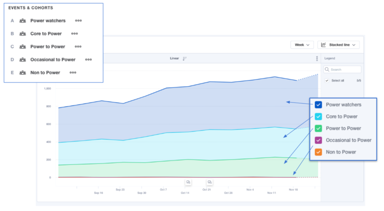
What we see here is a stacked line graph of the total power watchers cohort (dark blue), cohort of core watchers that turned into power watchers (light blue), cohort of power watchers who remained power watchers (green), and occasional and non-watchers that turned into power watchers (thin purple line).
From this graph, we can see that:
- The size of the total power watchers cohort is increasing over time
- The core watchers to power watchers cohort is also increasing in size, which is contributing to the overall power watchers cohort growth
- The power watcher retention rate is increasing slightly
- No big changes in occasional watchers or non-watchers into power watchers
This is good news for our video platform company. It’s an indication that the efforts that went into product “stickiness” and encouraging core watchers to turn into power watchers is working, and power watchers are staying engaged.
Now that we’ve gone through both analyses, you might be thinking they were quite similar. If this is you, you are correct. While lifecycle analysis and engagement segmentation analysis answer different things, both help you understand the “why” behind positive or negative changes in a group of your users through deeper segmentation.
To drive product-led growth, it’s not enough to know what and when things are happening — you have to know why.
If you aren’t a Mixpanel customer yet, click here to learn more.
Happy exploring!

