

To build a successful product, you need to balance data with intuition

Here at Shift, we’re all about the data, and we’ll be the first to tell you that we’re a data-informed company.
We use data to make product decisions, validate new ideas, and get our team aligned toward building the best web app browser in the world. For example, just last year we used data we collected to update our Epic Search feature. Our users were asking for a better way to comprehensively search across their apps and accounts, and we saw the usage trends to support the update in Mixpanel, our product analytics tool of choice. Pretty clear-cut.
But data isn’t everything. When it comes to being a data-informed product company, there’s an important element you don’t hear so much about. Probably because there’s no marketing slogan any SaaS company can attach to it.
I’m talking about the importance of maintaining a healthy level of product and user intuition in your data-informed decision-making. To build a successful product, you need data and intuition—combining both, and knowing when to rely on one or the other, is key.
Let me walk you through a product decision that dates back to the beginning of Shift to show you how we’ve learned to avoid getting lost by trusting our product instincts—without ever ignoring the data.
Building Shift: A solution to an existing problem
It was intuition that led us to launch and design our sidebar, and later, data that helped us validate our choices.
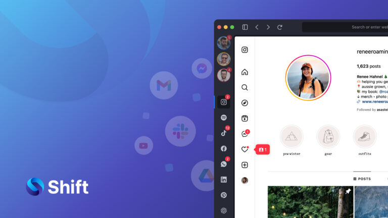
Shift was created in part from an idea I originally had in 2016. At the time, our team was working on many different ideas, and each had its own associated website and domain. I ended up with over eight different email addresses and accounts. I needed a better way to navigate and manage apps across different accounts, without having to open an incognito window each time.
I was inspired by a software I loved to use for email, so we built something similar for an app browser experience.
We wanted the user experience to be intuitive, so our users could switch between apps and accounts easily, without having to log in and out each time. I figured that if I was frustrated with the experience, there was probably a market of other frustrated users out there, too.
Instead of looking at a similar market landscape to investigate product usage trends, we designed and built with a mix of what we knew users like me wanted and what our team understood as an intuitive user interface.
Design should always lighten your cognitive load. You want using your product to feel easy, and that’s what we strove for.
We used research into eye movement patterns across a screen to design an L-shaped interface, with a sidebar on the left, which follows our culture’s left-to-right reading patterns.
Other products followed that same pattern, and still today, this L-shape design is fairly common. You can see the consensus around intuitive design that has happened over time, and you see this convergence towards left sidebars in many apps.
As our product evolved, we continued to use this approach to make changes to our interface and sidebar.
The evolution of the Shift sidebar: Balancing data and intuition
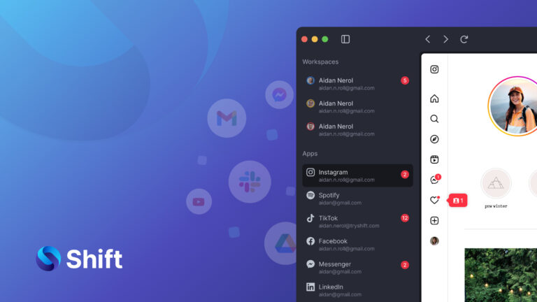
The Shift sidebar allows users to switch between different accounts and apps quickly. It worked well for me when I first tried it out, and it worked well for our users, who were focused on productivity and efficiently switching between accounts.
Over time, the feature also became a differentiator from traditional web browsers, which began trending more towards minimal, disappearing UI elements at the top, bottom, and sides of the screen to create a more immersive experience. As we saw more products in that adjacent space moving toward minimal UI, some signals led us to hypothesize that our users might want a similar minimalist experience.
But we had some reservations. The sidebar was a cornerstone of Shift’s interface, and it was at the heart of the solution I’d first envisioned when we founded Shift in 2016. We didn’t want to accidentally remove something that our users valued.
Our team built a feature to allow users to hide our trademark side nav to test how users responded. After building and launching the feature, our intuition was confirmed: only a tiny percentage of users chose to hide their sidebar.
This told us that the hypothesis that users wanted minimal UI was incorrect for the majority of our users, and it showed us that we might not have been paying attention to the right signals and data trends. Web browsers are not app browsers, and our users wanted to keep the ability to easily switch between apps and accounts. Our intuition, which was telling us to hedge our bets and keep the sidebar, was correct.
Using insights in unexpected ways
Even though our hypothesis turned out to be wrong, experimenting with our sidebar gave us valuable insights into user behaviors and wants that we didn’t have before. In fact, it ultimately led us in the opposite direction: Last year, we deployed a new feature that lets users expand the side navigation (or shrink it smaller).
Since the launch, usage data has shown that 18% of users actually like an even larger sidebar.
To be clear, we don’t regret building the ability to hide the side nav. It was a low-effort launch, and it has been useful for the small number of Shift users who wanted it. But more importantly, it allowed us to measure how our users felt about Shift’s sidebar and test different options.
That signal is the kind of data that could be worthy of overriding the intuition of any product builder. In this case, it helped our team decide to invest more in features that allow users to further expand and customize the side nav.
Our intuition was right—but the data and analysis helped us gain even more valuable insights.
Never ignore intuition when making decisions with data
When you’re building a product, intuition is important. Following our instinct about the side nav led us to merely build an option to hide it. Otherwise, we might have updated our design and removed the side nav from our product altogether. If we hadn’t listened to our intuition, we might have made a very unpopular change to our product that could have been costly to undo.
At the same time, quantitative usage data still trumps all in many cases—when you have it. It will help you validate hypotheses or pivot in a new direction.
It’s why I always love when new folks give Shift a try and let us know what they think. (You can do that here.) We never say no to more data.
Intuition becomes most important when you’re launching a new product in a fresh product segment, but when product usage data is available (showing you exactly what users are doing), it should still outweigh everything else. Trust your intuition—but let data be your guide.