How to use benchmark data to understand your users
In the past year, we released a Product Benchmarks Report as well as two reports specifically focusing on Media & Entertainment and Financial Services. (Look for reports on Retail & E-commerce and SaaS in the not too distant future). We built those reports with the goal of helping people understand how their own product performance was faring relative to the competition. But in order to help users understand that more fully, we thought we’d flesh out a few concepts that help users take the concepts from these reports and put them into practice.
This post is a guide to how to use the data in those reports to get a deeper understanding of your users’ behavior and your product’s performance.
Pick metrics and pair them
What types of metrics should I be looking at?
These reports contain an implicit answer to the types of high-level metric categories that all product owners should care about: usage, retention, engagement and conversion. Usage metrics ask “How many people are in my product?” Retention metrics ask “Are the people who are in my product returning?” Engagement metrics ask: “What are the people in my product doing?” Conversion metrics ask: “Are the people in my product doing what I want them to?”
These metrics are not meant to be stand alone, but to work together in an ecosystem built by you, the product owner. The simplest way to think about these metric categories is in terms of pairs.
Usage metrics and retention metrics go together. Engagement metrics and conversion metrics go together. The reason for these pairings is to make sure the product as a whole is moving in the right direction, rather than one single metric.
Pairing usage with retention is the simplest way to aim for sustainable growth. It’s extremely possible to increase usage without improving a product. Throwing ad dollars around is one way, for example. But if new users are being retained at the same levels as existing customers, that is a positive sign.
Engagement and conversion should be paired because they both relate to user activity within the product. Conversion data can help identify what types of engagement are actually correlated with conversion. Determining causation is a more difficult task, but seeing which sets of actions go together has value. In fact, even seeing which actions are totally uncorrelated are has value too.
A certain subset of users appears Monday through Thursday, and a totally different one appears Friday through Sunday? Interesting finding! Unless there is some reason to believe this knowledge can be turned into something more useful, it’s not particularly actionable. Perhaps notifications with special offers sent during high-activity days can increase conversion—that’s using data to make better business decisions.
Sizing up the competition
We basically ask a version of the same question on the homepage of each of our benchmarks report home pages. “How do we compare to the competition?” “How do we compare to everyone else?” “How do we stack up?”
Companies want—need—to know how they’re doing compared to their competitors.
These are the questions that spawned these reports, and these are the questions we’re trying to answer in them. Everyone knows how they’re doing on these metrics in a vacuum, but a vacuum is defined as having no breathable air and being immediately fatal to anyone exposed to it. All of which is to say, these companies are right to get a sense of what the atmosphere is like.
The basic instinct here–if my product is getting beaten, I should improve it or move on to something else–is the right one.
Time and time again, our data showed something simple, but true: maintaining a successful product is really, really hard. For SaaS businesses, we found that only 3% of users who have already signed up for a product end up subscribing. For gaming products, that number is a staggeringly low 1.5%. The median media & entertainment product is seeing declining usage. Point being, a bunch of these numbers—even when the economy is good, and tech is a vibrant, successful sector of it—point to challenges in a competitive, crowded space.

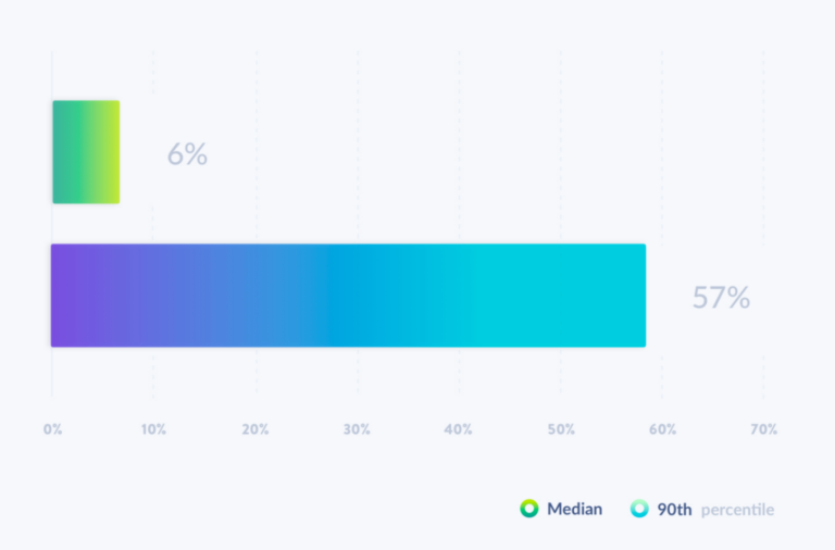
Here’s what our monthly ADAU growth rates looked like in the Financial Services Benchmarks Report. 57% month-over-month growth is unsustainable—it literally means going from one person to the entire earth’s population within five years. Understanding how much of your product’s total addressable market has already been addressed is useful context for these sorts of metrics.
Get as close to your product as possible
No comparisons between your product and a mass of aggregated products is ever going to be perfect. But we’ve done our best to make it so that readers can compare as closely as possible. To do so, in the main report, we divided the data by industry: SaaS, retail & e-commerce, media & entertainment, and financial services.
Within the media & entertainment and financial services benchmarks report, we also divided into sub-industries. For our Media & Entertainment Benchmarks Report, that meant looking at audio, gaming, video and written media products separately, and for our Financial Services Benchmarks Report and banking, insurance, money transfer, personal finance and trading & crypto products in financial services.
We also divided between whether users were accessing products through desktop web, mobile app, or mobile web. And beyond dividing by platform and vertical and sub-vertical, we provided median and 90th percentile data to give a sense of what’s “elite” and what’s more typical.

This sorting is designed to help readers understand whether they are lagging behind the competition because their product is succeeding relative to their industry (media & entertainment), sub-industry (video), or whether their in-house metrics are skewed by the distribution of users across these platforms more so than anything else.
Understand the limits of what you can learn from other people’s data
While learning from other people’s data can be informative, it does not paint a complete picture. After all, the only reason we’re able to aggregate this data is because so many teams have chosen to buy Mixpanel because of the view it gives them into their users.
This data is not meant to replace your own user behavioral analytics data. If we say that users of media & entertainment products typically have longer session lengths on the mobile app than on desktop web products, if your results show the opposite, that might mean there’s an opportunity to improve your mobile app. Or, it might mean nothing of the sort.
Consider this one more set of paired metrics: high-level benchmarks and user behavior analytics. Benchmarks without user behavioral analytics provide a general sense of what is going on in an industry, but lack for granular insight. User behavioral analytics without the context of industry-wide benchmarks is seeing just one tree in a forest of them. Seeing them both together allows users to see the forest and the individual trees—and hopefully watch them grow.


