The ultimate guide to conversion analysis
Is your business growing at a healthy rate? Conversion analysis holds a big part of the answer. By studying how many of your website or app visitors complete a desired task, and the steps they take to get there, you can discover ways to boost conversions for bigger growth. In this comprehensive guide to conversion analysis, we’ll define what it is, how it’s used, and look at some specific conversion analysis use cases.
What is conversion analysis?
Conversion analysis, also known as conversion marketing, is a process of analyzing website or app traffic data for specific, desirable actions—known as conversions—taken by users. What constitutes a “conversion” can vary greatly from team to team and needs to be defined within the framework of your company’s overall business goals, but conversions are typically linked to a visitor doing things like:
- Supplying contact information
- Creating an account
- Signing up for a subscription
- Making a purchase
Conversions are a key performance indicator (KPI) that virtually every business can use to improve revenue generation, retention rate, and more. It’s one metric that can gauge how a business is performing overall. That’s why conversion analysis is such a worthwhile endeavor.
Conversion analysis overview
The primary goal of conversion analysis is conversion rate optimization, which we define as the process of making changes to a website or app to increase the number of visitors or users who become customers, or the process of directing more users to perform a desired task that leads to a conversion.
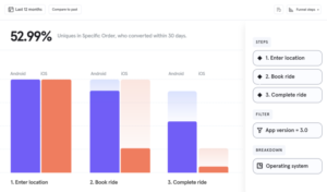
The fundamental unit of conversion analysis is the conversion rate, or the rate at which the website visitor takes the desired action. To get the conversion rate for any particular desired conversion, simply divide the number of users that took a particular action by the total number of users, then multiply that result times 100 to get the percentage, which is the conversion rate.
What’s considered a good conversation rate will vary widely from company to company and goal to goal or campaign to campaign. For one company, a 10% conversation rate may be incredible, while for another a 10% conversation rate would be disappointing. It will always depend on the product, the particular type of conversion you’re going after, and the greater context of what your business is or does, the stage it’s at, and how this particular conversion fits into the overall business goals.

An important part of conversion analysis is the conversion path, which is a form of inbound marketing designed to turn users into leads. Sales funnels typically comprise multiple conversion paths, and conversion paths typically comprise four key steps: the offer, the call to action, the landing page, and the thank-you or follow up.
What’s the value of conversion analysis?
Conversion analysis lets you understand if any of your content and website optimization strategies are working. Conversion analysis is just as much about what’s not happening as it is about what’s actually being done. When users are not converting, optimization can improve the results.
You could take a guess at what is preventing people from converting, but that’s a time-consuming, often costly process that may fail to provide any improvement. One of the biggest benefits of conversion analysis is it removes the guesswork.
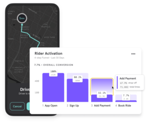
The trends and patterns in the data reveal optimization opportunities. They can tell you where users are dropping off so you can focus your attention and pinpoint the issue. They tell you what’s working so you can double down on those efforts.
At the end of the day, increasing conversions is the ultimate goal of doing conversion analysis. Being able to fast-track the process means you’ll miss fewer opportunities to generate more revenue.
A good conversion rate optimization strategy will help you improve conversions across your funnel, including the top of funnel (when leads are researching and discovering information), the middle of the funnel (when leads are thinking about converting and considering their options), and the bottom of the funnel (when leads are making decisions and getting ready to convert).
Conversion analysis also helps you gain a much deeper understanding of your users and their commonalities, some of which are obvious and some of which may be more discreet. Conversion analysis can show you who users are and what they do before, during and after converting. It reveals behaviors like:
- How much time or how many visits it takes a customer to make a purchase (time to purchase)
- Where customers live
- What devices they use
- Which marketing channels draw in the most customers
- Which products/services/subscriptions are the most popular
- Common behaviors within a customer segment
The more you know about who is and isn’t converting the more targeted your marketing and product positioning will be.
Ways to use conversion analysis within your product
Whether your product is an e-commerce platform, blog, or other type of B2B or B2C service, there’s a general process you can use to get the most out of your conversion analysis and make it work for your company and product.
Here’s a quick guide for setting up a successful conversion analysis process or any product.
Step 1. Define business goals
Conversion analysis isn’t possible without business goals that serve as benchmarks. Once you begin the conversion analysis process your goals help you determine if you’re on track or at risk of missing the mark.
Step 2. Establish conversion events that support business goals
Conversion tracking software simply can’t do its job without defining a conversion action. But a conversion isn’t just any activity. It’s reserved for actions that add value to the business and support your goals.
There are macro and micro conversions. Macro-conversions are your primary goals, such as completing a sale. Micro-conversions are all the smaller actions that lead up to a macro-conversion. If you’re just starting conversion analysis, start small with one macro-conversion and two to three micro-conversions.
For example:
Micro-conversion = visit a product page
Micro-conversion = put a product in the cart
Macro-conversion = complete a purchase
In general, it’s best to limit the number of conversion activities that are tracked at one time. Trying to do too much at once can cause information overload that’s more confusing than helpful.
Step 3. Choose an analytics platform
You’ll need a way to gather and aggregate your website data. Doing this manually with a proprietary tool is way too time-consuming for most businesses. It also requires the expertise of data engineers and analysts that may not be on staff.

A much simpler option is to use a third-party analytics platform. Mixpanel is one such platform that was built to provide in-depth conversion analysis at every stage of your funnels. The most important attribute to look for is the platform’s ability to integrate data and display it in a way that’s easy to read.
Step 4. Set up conversion analysis reports
This leads us to the next step – reporting. The data needs to be presented so that all stakeholders and decision-makers can understand the results. Another useful reporting feature is customization. Being able to parse and display the data in different ways can help you get more out of the information and zero in on specific details.
Step 5. Test the findings
Once you’ve analyzed the data you’ll want to make sure you’re reading it correctly. This is accomplished by running A/B tests and multivariate tests.
Conversion analysis for e-commerce
E-commerce conversions are calculated the same way as other conversions, but for e-commerce the desired action is a buy, so e-commerce conversion rates are typically the ratio of transactions to sessions, expressed as a percentage. As an example, a ratio of one transaction to every ten sessions would result in an e-commerce conversion rate of 10%. For reference, the average e-commerce website conversion rate in 2020 was 2.86%.
Of course, a key component of any e-commerce conversion analysis and optimization is going to involve the shopping cart—specifically, how often shoppers abandon their carts, which is known as the cart abandonment rate.
Shipping costs are a major concern for customers and have become one the main reasons for cart abandonment, so one good way to test and optimize your e-commerce website conversions would be to try out different offers and variations around shipping costs. You can also try to improve the customer experience with personalized offers that get your customers to make their purchases instinctively and hence without thinking about abandoning their carts.
Another key tacting in e-commerce conversion analysis is analyzing the conversion funnel, which, in the cas of e-commerce, illustrates the route your customers take from first becoming aware of your brand to making a purchase. It will also include things like customer retention, upselling, cross-selling, and subscription-based models.
Click here for a little more on ecommerce conversion KPIs.
Conversion analysis for content publishing
Content publishing is another ideal arena for conversion analysis. Landing pages, blogs, and other types of web content consumed by your users comes with specific desired actions you want the users to take, whether it’s to click on a CTA, fill out a form, spend a certain amount of time on the page, click on an ad on that page, or something else.
Done correctly and with a powerful analytics tool, conversion analysis for content publishing will allow you to:
1. Refine your messaging so that it speaks as directly as possible to your ideal audience
Since conversion analysis gives you valuable information about your users’ behavior, you can use it to refine your content so that it speaks directly to your ideal leads or prospects and their pain points, thereby making it much more likely for them to convert. Likewise, the more you can tailor the content not only to specific types of buyers but also to the specific stage they’re at in the buyer’s journey, the easier it will be to get them to the end of the conversion path.
2. Improve UI to get more conversions via form fills
Any kind of signup or form-fill process needs to be as simple as possible in order to optimize your conversions. A large part of this is ensuring the page design elements are simple and powerful, and the other part is making sure the form itself is as easy to fill in as possible. Conversion analysis can help you get a clear picture of what’s working and what’s not in terms of UI.
3. Better understand which assets work best for which audiences
Finally, conversion analysis for content publishing can help you determine which type of assets to use and when. Perhaps a free but gated infographic will garner more leads than a monthly newsletter? Or maybe, a downloadable ebook would convert more leads than a webinar. Attaining a deep understanding of why your content performs the way it does and acting on that knowledge to improve this performance is the ultimate goal of conversion analysis in content publishing.
Click here for a little more on KPIs that measure the success of digital content.
“Mixpanel enables Gekko to make the best decisions based on real data to improve the overall growth. As well now Gekko can easily show users only the most relevant messages based on their actions.”
Conversion analysis FAQs
How do you analyze conversion rate?
As mentioned above, what’s considered a good conversion rate varies from one company to the next and can even vary from product to product. A conversion that is subpar for one company can be completely acceptable to another. For example, Company A generates $100 per conversion, but Company B generates $1,000. If they both have a 10% conversion rate that could be great for Company B but might not be so good for Company A. Likewise, if a company has a 2% conversion rate but through optimization increases it to 4% that might be considered good in comparison. The best way to determine a good conversion rate for your company is to know what your current conversion rate is and set a conversion rate goal for the next month, quarter or year.
What’s an example of a conversion strategy?
A conversion strategy is a plan to make specific changes to a website or app based on user behavior data. The strategy will aim to optimize various parts of the funnel. Each stage of the funnel is individually analyzed then optimized. Funnels can be broken down into three primary stages:
- The top of the funnel is the beginning when leads are researching and discovering information.
- The middle is when leads are thinking about converting and considering their options.
- The bottom is the point when leads are making decisions and ready to convert.
There are a number of CRO strategies that can be used at each stage to increase conversions. It all depends on what the data reveals.
What are the three types of conversions?
While there are many types of conversions (ie, desired action) and the conversion type will depend on your business goals and what you sell, the three most common conversion types are:
- A purchase
- A form-fill or asset download
- A registration (ie, for an event)
What are the key conversion rate KPIs?
Key performance indicators (KPIs) are metrics that tell you how well you are hitting goals. KPIs that can suggest whether or not CRO is working include:
- Sale/purchase
- Repeat visitors
- Cart abandonment
- Registrations
- Landing page signups
- Average order value (AOV)
- Cost per acquisition
- Customer lifetime value
- Revenue per visitor
Essentially, which KPIs matter most will depend on your optimization goals and the product or service. To learn more, check out the G2 report here about how AI is impacting mobile user acquisition.


