Improving user experience & drive engagement
Last year, we came to a realization: we were building and launching products faster than our interface could handle. It was becoming harder for customers to use our product, and it was becoming harder for us to scale. Our customers noticed. Many of them had trouble understanding the specific purpose each individual feature served.
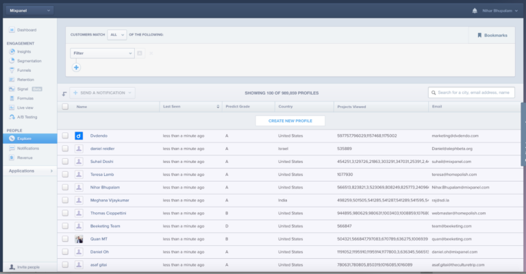
On top of that, we were running out of space. We had to start adding features in a stacked line on the left in a side-navigation. Not only was that inconvenient for our customers, it was slowing our development cycle because each team had to decide where a new feature went and then figure out how to promote discovery of that feature. We needed to find a way to group our reports into categories that would make sense for users on an emotional, intuitive level.
To solve the problem, we started from ground zero to rethink our navigation, our hierarchy, and our overall structure.
But a redesign is never just a redesign. In order to make this project work, we needed to gather qualitative feedback from customers in both the ideation and design phases, run A/B testing to see what worked, and then, after launch, run more A/B tests until we were seeing the results we wanted. Along the way, we ran into some obstacles we anticipated – such usage declines in certain reports – and others that made us scratch our heads.
Before we discussed any potential changes, we set clear requirements and goals for the redesign.
From the beginning, we were clear about one requirement: our new navigation needed to be able to scale with us as we grow and allow us to add new features over the next few years. That would mean accommodating all our existing features, promoting the features we cared about and demoting the features that were less useful for our customers. This required us to think deeply about where the product was headed and how to make space accordingly. Any design that couldn’t expand as we did wouldn’t be considered.
Our first, simplest goal was to increase usage in our key reports. We needed to ensure that the features that our customers cared most about were easy to find, but that we also still had a way for customers to discover new features as they came out. To that end, we defined several of our key reports as “tier one,” and looked to see if we could generate a statistically significant increase in usage of some of our key reports. While we couldn’t know for sure how users would respond, at the very least, we could ensure that none of our tier one reports would experience a decline in usage.
The third goal was simple – to visually refresh the product. We hadn’t redesigned our product in four years, and it was time to give it a more modern look and feel. This would be measured in two ways: how do users respond to the new design, and through their opt-out rate. That is, how often do users who got the new design choose to click a button to go back to the old design. If we could keep that under 20%, we would hit our goal.

Mixpanel before the redesign.
Step one: ideation through card sorting
The team started with a card sorting exercise. We created descriptions for each of our product’s features without naming them and had our own employees, as well as customers, start to group them based on the descriptions we provided.
For example, some described Messages as “a product that allows you to send targeted emails to your customers to re-engage them.” Maybe our Insights product was something along the lines of “allows you to deeply analyze user behavior.” As we added more and more participants, we saw a lot of similarities between how our customers and our employees grouped features together.
Step two: conduct user research to test our designs
The team started with some very basic design prototypes and we wanted to make sure our customers were involved in every stage, so we recruited current customers to come in and participate in usability studies. To find them, we used Mixpanel messages to send in-app messages directly to the right users, using our granular targeting.
In the very first round of research, we brought in about ten customers. The team spent time walking them through the prototypes, walking them through the groupings, and then testing whether they could find the things they needed and if they were getting stuck anywhere. The exercise helped us determine the most intuitive versions as we continued to iterate.
Our top priority was identifying the ideal grouping. We had a hypothesis based on an analysis of the correlation of features as well as the results of card sorting exercise to guide us, but we really wanted to corroborate these findings. In order to do that, we ran other series of targeted in-app notifications that encouraged users to take a survey. The survey asked them navigability questions: basically, variations on “where would you expect to find X feature?” Each survey would hit 50 to 100 people. We ran more than ten rounds, so, in the end, had around 1,000 users that ended up participating and filling out a survey.
The survey allowed us to turn our qualitative data from the card sorting exercise into quantitative data. This gave the team more confidence as we went into our rollout strategy. Still, we couldn’t be certain until we did another round of testing.
Step three: A/B testing

The initial beta phase covered 10% of our user base, who automatically had the new navigation and style. They would help us measure initial responses to the changes.
During the beta phase, we allowed customers to opt out if they didn’t like the new design and then returned them to the old version. Initially, though, we saw a very positive reaction. Our opt-out rate started at around 15%, and then lowered to 8-9% over time—well under our goal of 20%.
Because we saw a positive signal in the beta phase, we felt ready to move into the A/B test phase. In the A/B test phase, one group (30% of all users) received the new navigation. 60% of users, our control group, remained in the old interface.
We ran it for a couple weeks so that the results would have statistical significance. I tried not to check in on the results too often, but after spending all this time redesigning our product, it was hard to resist looking.
Step four: reviewing qualitative and quantitative results
On the qualitative side, we received a lot of positive emotional reaction. More than 70% said they liked the new version better. Similarly, the A/B test results showed that our most important reports saw significant increases. Dashboards, for example, saw a 30% increase off the bat, and then leveled off at around a 15% increase relative to the control. Large increases can occur at the beginning of a product redesign and can be deceptive, so we were more interested in what portion of the usage growth was sustained. Even Insights, which was already one of our most universally adopted reports, saw a 25% increase that leveled off around 15%.
There were other reports that saw big increases in tier two and tier three. Predict, for example, saw a 3X increase after it was promoted to a primary place in the navigation.
There were some negatives as well. Some of our reports actually saw a small amount of decrease. Funnels and Retention were seeing around five percent decrease overall, relative to the control groups, which was definitely concerning. This was not what we wanted, and though the net change of the redesign was positive enough to convince us to launch, we wanted to investigate what changes might reverse this trend.
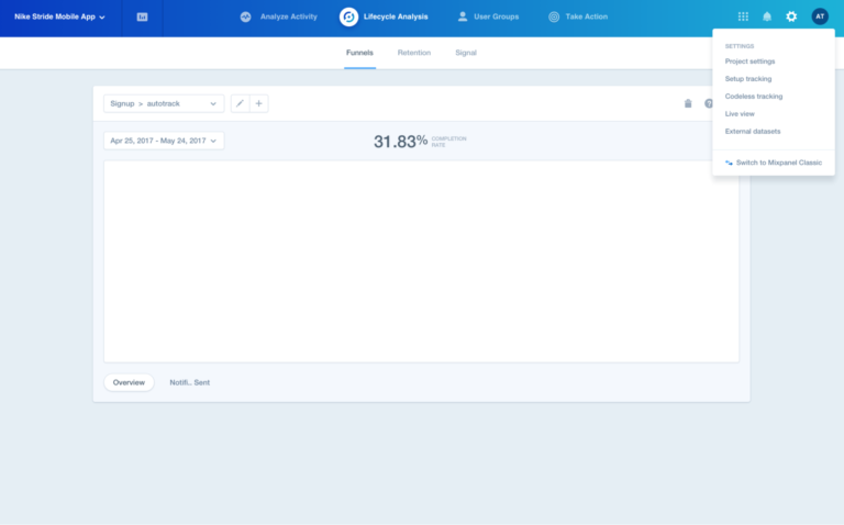
Our team noticed that new users were showing more prominent declines in terms of using Funnels and Retention. That led us back to our original research, which showed that the category that contained Funnels, Retention, and Signal – called Lifecycle Analysis – tested the poorest overall. Though that category had tested positively, it didn’t test nearly as positively as the other categories. It was interesting to see that our initial research, even though it was positive, had early signs that this was our weakest category.
So even though the results showed that the redesign has had a positive impact, the team still had work to do. So we shipped our redesign and immediately set to improve it.

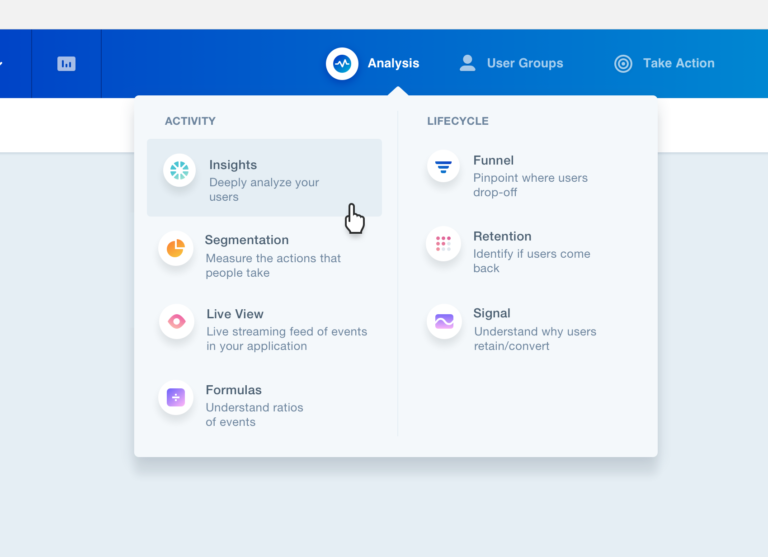
Mixpanel after the redesign.
Step five: A/B testing again
After we shipped the product to everyone, we immediately started another A/B test on the groupings themselves. For the test group, we combined “Activity Analysis” and “Lifecycle Analysis” into a single “Analysis” category. Funnels, Retention, and Signal all sat under the same drop-down menu as Insights and Segmentation and other core reports.
We just got the results back from that A/B test and found that usage of the tier one reports that had been adversely affected had since improved. Compared to a control group, Funnels was up 9%, Retention up 10%, and Signal up 40% in terms of daily active users. The changes brought Funnels and Retention to where they were or slightly above where they were prior to the redesign, and gave Signal a significant boost. Because of these encouraging results, we’ve now shipped the new version to all users.
It’s not slower, we promise.

With redesigns, it is impossible to anticipate every objection. We didn’t consider the possibility, for example, that users would experience the product as slower since our metrics show that the new version is not slower. There was no difference in speed, and yet, we received numerous complaints that there was.
So then, the question was: why is there a perception that it’s slower now? Whether it actually is slower or not, if users have the perception that it is, that’s a problem we need to solve.
After talking to some specific users, we discovered that it was a UX problem. The specific issue was the fact that the new navigation has menus. The menus open up with the drop-down, and when a user clicked on the dropdown, it wasn’t immediately responsive and there wasn’t an immediate loading state, which made it feel a lot slower than the old navigation.
To address the problem, we changed the UX interaction so that when a customer clicks on any item in the navigation, it immediately closes the menu, and throws up a loading spinner. Though it doesn’t change the performance at all, it seemed to satisfy our customers, who now say they find it to be faster than the old version.
A response like this proves that, with all redesigns, teams can do all the preparation in the world, but there will always be unforeseen risks and unanticipated consequences. The most valuable preparation a team can do, then, is prepare to adapt quickly.


