
How we build with data: Experimenting with Mixpanel’s new side nav


Here at Mixpanel, we’re all about helping our customers get more answers from their data. As a product-led team, we believe that the power of our platform speaks for itself. We use Mixpanel every day to guide our own product decision-making and gather the data we need to give our users the best possible experience.
We recently used Mixpanel to guide our side nav redesign. Here’s a step-by-step look at our process and how we used data to build it.
Identifying the problem
Everything started about two years ago when a hard truth emerged: Mixpanel’s navigation had gotten too confusing. It was split between a top navigation bar and a sidebar, and users were unsure where to look for different features. We knew we needed to consolidate things to make the logic clearer.
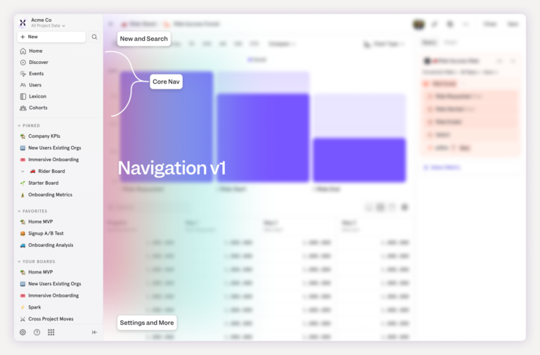
So that’s what we did. One of our designers consolidated Mixpanel’s navigation onto the left side, removing the top navigation completely.
That improved a lot of our key metrics. For example, more people were accessing Lexicon than ever before. Clearly, some of our important features had been hard to find, and streamlining the navigation solved that.
But not everything about the change was successful. Fewer users were accessing our “core reports,” the Mixpanel report templates that people use to get answers to their questions. Before the original redesign, about 20% of users created core reports. After the original redesign, that number dropped to around 15% of users.
Those core reports are a key part of our value proposition, and we needed to understand what was happening and get those numbers back up.
Building a hypothesis
Part of the problem was obvious: After the first side-nav redesign, Mixpanel had released numerous new features, including Metric Trees, Experiments, and Session Replay. The sidebar was getting too crowded.
Our main hypothesis was that consolidating and streamlining the side navigation would improve key metrics, including access to our core reports.
We started to explore different changes to make the sidebar easier to use and less crowded, and we landed on the following options to test.
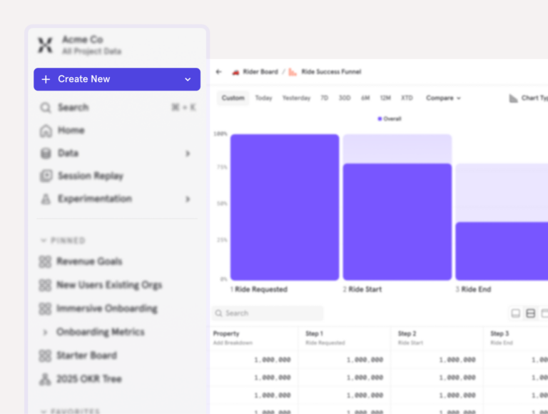
New report button and dropdown
The first one involved changing the “Create New” button color from gray to purple, to help it stand out. Because of the additions to the side nav, our theory was that the gray button was blending into the background. Helping it stand out might increase traffic.
We also proposed adding a caret dropdown icon to the same “Create New” button, as people might be hesitant to click it out of fear that clicking would take them away from the current page. If we made it clear that it opened a dropdown, they might be more likely to explore.
Adding headers to the dropdown and reorganizing the order
Our second hypothesis was that users might not understand what each option in the New Report dropdown menu represented. We suggested reorganizing it by category and adding headers that explained each section (e.g., Reports and Experimentation).
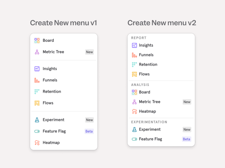
Decluttering the navigation options
Our third hypothesis was that the list of options in the left nav was getting too long. We shipped many new features over the last year and things were getting crowded.
Combining similar features
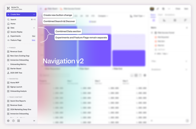
To simplify, we combined some of the similar areas in the left nav into parent/child sections. We grouped all data-related items (Events, Users, and Lexicon) into a section called “Data” and our new Experiments and Feature Flags tools into a section called “Experimentation.”
Moving “Discover”
Finally, we recommended experimenting with moving the access point to our “Discover” page, which lived below search, to make the sidebar less crowded overall.
For all of these potential changes, our main goal was to increase the percentage of users creating new reports.
Once we had an idea of the different avenues we wanted to explore, we just needed to test them. Fortunately, Mixpanel has new Experimentation features that we could use for exactly that purpose.
3. Creating a testing plan
At Mixpanel, we almost always work in cross-functional teams. For this project, we had a product manager, product designer, and engineer working together to design the experimentation approach and decide how best to deploy our experiment.
It was a great opportunity for our team to dogfood Mixpanel’s new Experiments and Feature Flags, and use those tools to test the navigation changes.
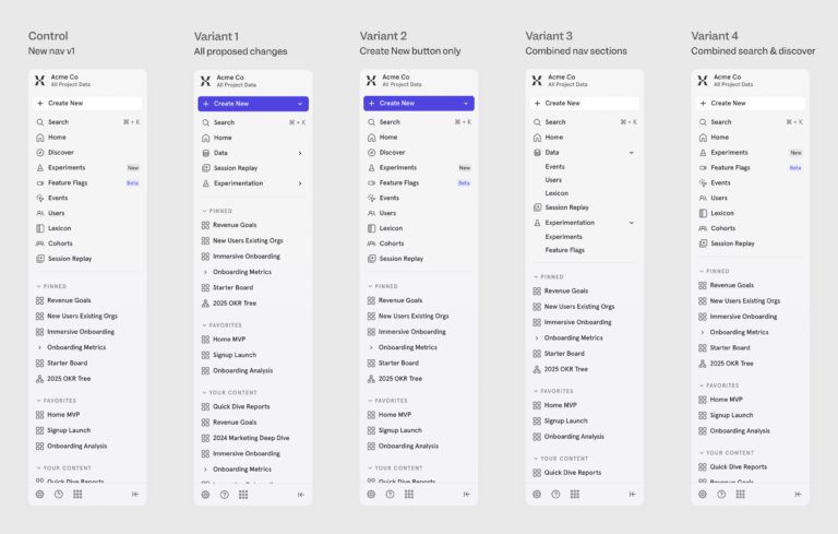
One of our options was to create a single A/B test that grouped all of the changes together, comparing a new side nav to the current one. But we wanted to get more granular. Instead, we created a multivariate test, with some variants including a single change, some with several, and one that had everything combined. This allowed us to see exactly which changes contributed to improvements in our metrics.
4. Running the experiment
We used Mixpanel’s sample size calculator to make sure our results would be reliable, and our engineering team added Feature Flag variants for the different nav combinations we wanted to test. The Experiment feature took care of the methodology for us, so we didn’t have to worry about statistical significance or how our experiment was built.
We first rolled out the test to internal users (Mixpanel team members who use Mixpanel as part of their job) and later to a small group of external users (Mixpanel customers).
Pretty soon, we started getting clear results. In the Experiments interface, green meant good (improvement in our metrics) and red meant a drop. We tracked the metrics we wanted to improve against our guardrail metrics, to make sure that any changes didn’t inadvertently cause a drop in performance somewhere else.
💡Experiments on experiments
Dogfooding the Experiments tool made it fast and simple for us to test our theories. It allowed us to give the Experiments team feedback from a user perspective, too. We noticed that some of the text was truncated, which made it hard to read what each of the metrics we tracked was. Once we flagged that issue, they updated it quickly.
5. Analyzing the results and implementing successful changes
Looking at the results, we saw that nearly all of the proposed changes had positive impacts on our side nav and key metrics, including the percentage of users who accessed core reports.
Inside the numbers:
• percentage of users creating core reports: all_changes +12.43%
• create_new_only: +15.91%
• combined_nav_sections_only: +6.04%,
• combined_search_and_discovery_only: +0.92%
There was one important exception. One proposed change—combining the "Experiments" and "Feature Flags" into a single section—caused a significant drop in the number of people visiting those pages, highlighting a problem with discoverability: the combined ‘nav sections only’ variant showed us a 70.06% drop.
Dogfooding our Experiment and Feature Flag tools to run this test helped us avoid causing a problem with our Experiment and Feature Flag tools, which is pretty meta. That was fun for our team to think about.
In the end, we shipped all changes except for combining Experiments and Feature Flags. They were gradually rolled out to our entire user base. Users accessing core reports increased by 12%. We also saw an unexpected 45% increase in users viewing Session Replay, a feature that wasn’t part of this experiment at all. Our theory is that other changes to the side nav made this feature more visible, making users more likely to find it.
Finally, users can be a bit sensitive to interface and navigation changes, so we were a little apprehensive about the reception from our users. To date, we’ve received zero negative qualitative feedback.
Bonus: Running experiments is fun
This project had positive results: We were able to improve key metrics and make our side navigation more user-friendly. It was simple to set up, easy to run, and a lot of fun.
That’s our most surprising takeaway. Experiments are fun to do. It’s fun to see what happens and how your ideas will play out. We had to stop ourselves from peeking at the results early.

Have some fun. Get some answers. Try Mixpanel experimentation today.