What are in-app notifications?
How are in-app notifications and push notifications different?
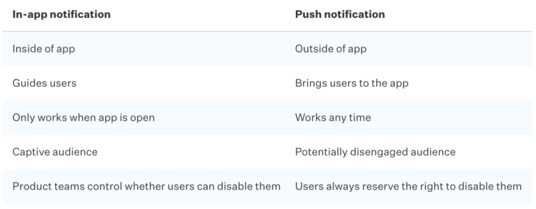
Like the name implies, in-app notifications appear within your app and only while users have it open. Their close cousin, the push notification, appears outside of the app, regardless of whether the app is in use. While push notifications target users who aren’t currently using the app to (hopefully) bring them back, in-app notifications reach a captive audience of users who are in your app and already engaged.
Like push notifications, in-app notifications are, technically speaking, interruptions. It’s critical that app creators, product designers, and marketers carefully consider their user experience and only send messages with a purpose. Too many non-essential notifications can frustrate users who might then silence notifications or stop using the app entirely.
Used carefully, however, they’re among product teams’ most powerful tools.
Compare in-app notifications and push notifications:

Why are in-app notifications great for product teams?
In-app notifications are fantastic for pushing users forward in their customer journey and your marketing funnel. They serve as product teams’ primary form of communication with users and because these notifications can be triggered based on any mixture of segmentation, behavior, or timing, they allow app creators to customize the journey for each user.
Here are some benefits of in-app notifications:
- Increase LTV
- Increase app usage
- Increase app retention
And here are common use cases:
- Gather NPS and discover advocates
- A/B test marketing messages
- Onboard new users
- Suggest additional features
- Cross-sell, upsell
- Guide users through the optimal experience
- Prompt users to update the app
- Prompt users to enable push notifications
Do not use in-app notifications to:
Force users to take an action unless it’s critical and necessary, alert users of things that don’t require their attention, like passive error messages, or over-communicate.
Within every app, there are multiple personas, from novices and fair-weather friends to power users and super fans. Product teams can and should segment in-app notifications to account for users’ unique interests and behaviors to help them each get exactly what they want out of the app.
How do in-app notifications work?
In-app notifications come in two types: transactional and non-transactional. Transactional notifications are set to appear automatically to provide guidance and help users master the app. Non-transactional messages are everything else, including flash sale offers and new feature announcements.
To send effective in-app notifications, product teams must have the ability to do three things, which not all apps natively possess:
- Identify unique users within the app
- Selectively target, schedule, and notify users
- Analyze the effects of notifications
Notifications can be triggered based on demographics, timing, behaviors, or a combination of the three. It’s a good idea to coordinate these notifications to support your customer marketing funnel, for which you’ll likely need an app marketing platform. Without such a platform, teams must build a similar in-house interface which can be cumbersome and expensive.
From within an app marketing platform interface, product teams and marketers can build their in-app notifications. These can be set to appear as full-screen pop-ups or miniature pop-ups. Each can include the following elements:
- Text
- Graphics
- Links or deep links
When designing in-app notifications, be simple and concise. Use minimal text, stay on-brand, and front-load value, which means you should put the most important words in each sentence first. If you include images, make them relevant. If you include a deep link, highlight text which declares where it will send users.
What are best practices for in-app notifications?
The best in-app notifications don’t feel like interruptions – they feel more like helpful guidance. Here’s how to create notifications that feel right:
1. Set clear goals
Begin by setting a goal. If you’re going to interrupt users, it had better be for good reason. Over-messaging can frustrate them and backfire, decreasing app usage. So, is your goal to increase app usage, onboard users, upsell products, or something else?
2. Segment users
Divide your users customer persona and create different notifications with messaging targeted to each.
3. Test, analyze, and optimize
If you’re using an app analytics platform, you may have the ability to conduct A/B testing. Use the data from these tests to hone in on the perfect notification design.
4. Coordinate in-app notifications with all your other marketing efforts
In-app notifications don’t occur in a vacuum: customers are also likely getting messages from your marketing team via push notifications, email, social media, SMS, and more. If product teams and marketers don’t coordinate, and customers receive reminders about actions they’ve already completed or offers for features they’ve already purchased, they’ll become confused and irritated.
5. Don’t over communicate
Communicate only as much as you have to and not a touch more. Users are highly sensitive to overly talkative apps and easily upset. Use your app analytics platform to identify areas where they’re struggling in their user journey and apply in-app notifications to propel them forward.
6. Deliver value
Finally, only communicate for a good reason. For every in-app notification your team designs, ask whether every element supports your primary goal. Does the text try to say too much? Is the image supportive or distracting? And does the link take users somewhere they’ll find value? If so, notify away!
Want to learn how to create in-app customer journeys that users love? Learn more about Mixpanel.


